Thank you guys! Yeah it came out just the way I imagined it. Super fun throw. The green is also super nice. Hoping the lavender one ups it for production.
tester/1st reviewer protos landed saturday/today, and have heard so many positive things!! So excited to get this into others hands!
Man that’s super awesome! Congrats! You seem like you’d be so cool with kids!!
Thanks man! Its been a little rocky so far but its getting better every day
What a delightful surprise!
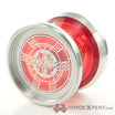
It looks SUPER green in person, by far the greenest yoyo I now own.
I’ve been chatting with @hobbygod frequently about yoyo design for the past months, and seeing him really take to this has been really rewarding. This particular model had a few design hiccups (now resolved) and many, many iterations and improvements as he’s learned CAD essentially from scratch.
It plays good, feels unique, and looks like nothing else I own. The light mass really complements the small size, and the little cutout in the profile is the perfect accentuation to the overly broad, bulbous wings.
The cup is practical and efficient. A small spike to house the slightly longer axle, with the rest of the cup cut away. There’s a ring that matches the cutout in the profile, and a slight undercut.
It plays fairly forgivingly while feeling much smaller than everything else I have, as I’ve since gotten rid of all my small/micro yoyos. I feels neat and round and wide.
It’s a very nice yoyo.
Thanks for the writeup! Appreciate it a lot! Also way to show off my horrible handwriting too ![]()
Atleast I can read it. I can hardly read my own sometimes.
I feel that.
Thanks for sharing! Check out the review if you havent already! Nate did a good job!
Hey guys, trying to figure out an engraving for 50/50. Whats your favorite out of these? Trying to feel out what everybody likes today. Probably will order production run tonight or tomorrow! I’ll throw a poll up with it but commenting why its your favorite would help me a lot too.
- A
- B
- C
- D
- E
- F
- G
I like “b”.
The yin yang done as outlines in bold. I feel the solid white/black (a)would detract from the color as it should look like a gray “eye” when it spins. The thinner outline(c) just doesn’t have the same presence.
B has the perfect balance IMO.
They all look like winners though.
It’s hard to say, I’m a minimalist and like option d.
But hard to say how it would look on the green. Such a bold colour may need a stronger logo.
Right, im leaning B now for sure. Maybe I’ll try B with the lettering of G? We will see.
Also the planned production run color is what I had the engravings put on. The 5 prototype greens are going to stay unengraved.
You could put the upper 50 upside down as a matter of symmetry.
Edit… I see you already had that idea.
Looks great dude!
Nuff said!
I like B but with G’s Font
This is what im leaning towards atm and what im gonna have drawn up in a couple hours.
I realize I can’t make everyone happy but I like to have transparency in the process.
FWIW, I like the subtlety of D. I think engravings are very wise as more and more yoyos are released, many of which have no engravings to help with ID years down the road (How often to we see “Help me ID this yoyo” posts?). At the same time, I usually appreciate minimal approaches on metal throws when it comes to engravings. Simple but stated. There, but not the focal point.
Thats actually why I want an engraving in the first place, as an ID. Also I think the yin yang looks super cool.
And it helps when your cousin is a graphic designer too ![]()
