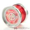
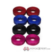
It’s absolutely a fitting symbol for this throw. Good thinking!
I feel so lonely in the “A” camp ![]()
Wont someone join me please? I’m getting so cold and my spirits are all blue here!
Okay, well at least I’m not the only cold and lonely one here anymore!
Want to be friends @TheThrowingGnome? ![]()
If it makes you feel any better, he’s lonelier by percentage. Proof that not all opinions are equal ![]()
I noticed that too! Simpler is better when it comes to engravings imo. Also I’m a proponent of the LAWOFONE and think unity is greater than duality!
I like big bold and unique engravings personally ![]() that’s what appeals to me about ‘A’ here…it’s really big and bold.
that’s what appeals to me about ‘A’ here…it’s really big and bold.
I do like more “in your face” engravings in some cases. The Pyro X is a good example. But mostly not. Classy. Understated.
I’d buy one
Not a huge fan of the engravings, but I think F is the cleanest looking. If the cup was flat with a center spike then any of these would work well, as it is though, I just don’t like when engravings go over angles. I would say make it smaller (like size of E) and keep it on one face, but I may be in the minority here.
Here’s a new set of engravings. Im kinda leaning towards B3 or B4. B4 has kinda the best of both worlds for me bc its big and clean but a lot less “solid” looking. Let me know what you think of all of these!
Also, one side or both? Im open to either.
I like B1 here ![]() I like how the number is inside of the dots (lol or however you’d word that haha!)
I like how the number is inside of the dots (lol or however you’d word that haha!)
I feel that. They’re all contenders I think.
I really like engravings on both halves ![]()
Yeah will probably go with both halves. I was thinking just 1 for potential half swaps if people wanted both sides engraved/no engraving, but that could get messy on my end as a seller.
I will second B1
I lied. Were gonna do a strawpoll to combine answers here with Facebook.
B1 is the one
I feel like the more aggressive font takes away from the cleanliness of the design and the circular housing of the numbers fails to compliment either the head or tail of the bulbs due to the inconsistency in roundness, so I feel like b2 best compliments the ying yang symbolism.
I’m probably not going to be able to afford one, but thought I’d throw my opinion out there lol
Also have you considered adding another bulb and giving it google chrome colors? lol
Haha thats hilarious! I dont think they can engrave in those colors tho.
And they’re not gonna be too expensive. Price point right now is 55 shipped for a grades.
No rim engraving?
