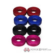
What’s your favorite color scheme, or a new color scheme you’d like to see in the future? ![]()
Any bright solid colors really… I love the look of a raw yoyo also
purple acid washes. like ash berry or berry berry
Dark solids, like blues, blacks, and purples, bicolors like the blue/gold dm2, either with lasered scrollwork, or understated washes in similar colors.
I couldnt decide which colorway I disliked the least when I was ordering my Di Base 2 so I decided to go with the colors I hated the most and picked the green with gold splash. Turns out the colors are really awesome , kind of reminds me of an emerald scaled reptile basking in the sun when I throw it.
Generally though I prefer bold non-shiny colors like “juggle orange” , green or non-shiny black, stuff like that, I am still kind of bummed I missed out on the green rally.
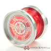
Red and gold FTW ![]()
Blue acid wash with magenta splash, as my company’s logo is a blue fade with an accent of magenta.
I absolutely love the galaxy colorway on the proton that has to be one of my favorite so far.
I like a darkish color with a lighter color splash. Or splash of both dark colors.
I also like a light color base with a dark color splash.
Other colors I like are: Raw, Nickel Plated, Silver, Purple, Orange, Red, Blue, Green, Wasteland, Ash Berry, Electric Bacon, Pink
Yeah, I know, I like a lot of colors. But then again, there are a lot I don’t like.
There is also the fact that some colors look better with some yoyos instead of others. Do you know what I mean?
In order (I guess):
- Red
- Black
- Red and Black
- Purple
I think that’s it! 8)
Green, Pink, and blue are my favorite colors to have on yoyos.
Different colored halves with a nice bright white string. My Bape Cascade looks so good with white type X.
Those are really cool.
The Hulk Smash Fade edition of the Summit really appeals to me, but alas, there are none available. :-\
I like solid black but it has to have engravings
solid I like violet
splash I like light blue on black
More bright solid colors.
It’s becoming a pain to buy solid color yoyos. Seems like every run except the first are just ugly (in my opinion) splashes.
I much prefer the simple over the more complex look.
well eventually you will have most of the solid colors and then all of a sudden you have like 5 blue yoyos and 20 red yoyos.
Im not against solid yoyos but I also like spashes they sometimes look stunning or flashy.
It gets peoples attention when you yoyo.
Agreed. Have you seen the Format:C yet? The solid color with the cut on the rims is pure simple elegance. An acid was or splash would not work on that.
ok now I see your point on some yoyos it will not look good but on some spashes look amazing.
YOGI FTW ![]()
