There is quite a bit of discussion here on yo-yo shapes, so I thought it might be ok. Nothing really too surprising in the article really.
Nice! As these things go, it’s much easier to identify the “what” but not the “why”.
Funny to think of jagged, angular, shapes being inorganic (like a rock) and round curves being organic (like a living thing) with respect to yoyos, but yeah… there it is.
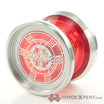
Why do I like the aesthetics of organic yoyos with flat cups the best? Harmony? That it looks more like a living thing? I dunno about that… in art and music I like dissonance a lot and its relationship with harmony.
Ok, maybe for something that I will put in my hand and throw, a round yoyo appears much more appealing to pick up and handle than an angular yoyo. For me, looking at a bunch of different yoyos sitting on a tabletop, the shapes of organic yoyos just beg to be picked up and handled.
Angular yoyos just do not look cozy for my hand and they appear to want to make contact with my face during their flight. In fact, Fragment, you look super great and all (nice curves in there despite the overall shape), but I’m looking at you and your small bearing and gap + angles and I know that I gotta do plenty of safety throws when we work together. But I know, too, it’s all appearances… when it comes to a metal yoyo flying towards the face at high speed, it doesn’t matter so much if it is round or angled, in the end the result can be pretty similar!
I actually have a different experience entirely, where the sheer efficiency of a design is beautiful to me, and as a result a lot of the comp oriented, wide, huge catch zone style stuff is very appealing.
A big turn off though is excessive cuts for style reasons like UNPRLD though. And the more clean the design the more it appeals to me too. So like people mention stuff like the pistolero being a beautiful yo-yo but it just has too much going on for me.
It’s also ergonomics and comfort. Especially when a sharper object is snapping back to your hand.
I get what you’re saying. That’s why Yoyorecreation was major for me – in their original minimalist incarnation their designs were a perfectly elegant fusion of form + function. High performing but super sleek.
Meanwhile, though, I just throw for pure pleasure so that plays a lot into my interest in organics.
Otherwise, though, I gotta say that there are some yoyos today that by all accounts are super high performing that I find to be super ugly. Too much going on, a gazillion materials, splashes, grooves, micro-angles, strange nipples or indented cups, engravings all over the place, too many colors, and so on.
I actually agree with this, but our definitions of too much probably vary a little bit. I definitely prefer a clean look. IMO the Wide Angles without the large engraving are much more nice to look at than those with it.
I agree. Anything thats got a smooth profile is nice to me, regardless of shape.
I also like chunk rims too!
Any word on the signature?
5050? Protos still being machined. Idk why they’re taking so long
Nah the Retic one.
No word yet. I’ve made a couple designs that we love, but not sure if I’d consider any of them to be my sig. There is one that I want to make that I think would be solid for my 5a progress, but not sure what id want in a 1a yoyo. A signature yoyo would be super challenging for me bc I’d want to make something that really vibes with me, but idk if that would vibe with everyone else for 1a. Im also super happy with using death adders for 1a.
