


Long time member will remember that when I came out with these… http://yoyoexpert.com/forums/index.php/topic,14877.0.htm
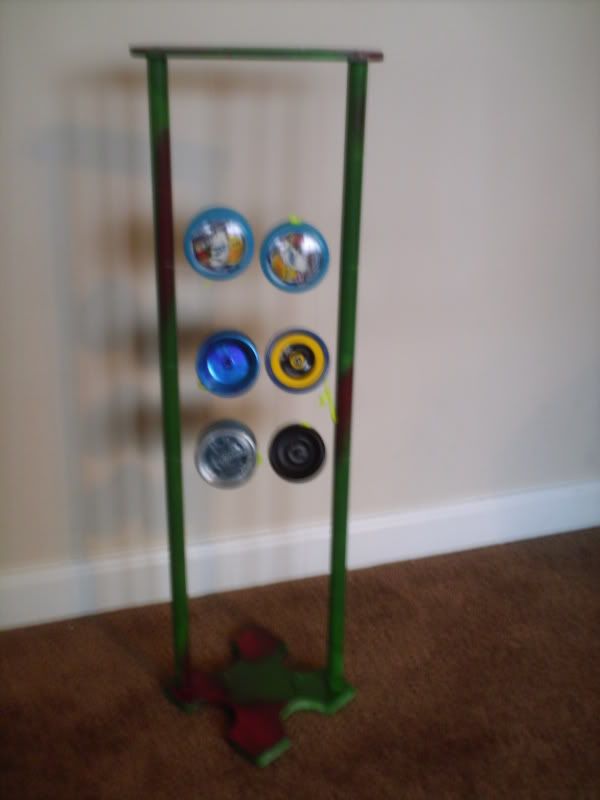
Well, every since then I’ve been thinking to my self, is there any way I could make these a little better? Well, it took me about a year, but I’ve completed the final prototype for the next version deemed, for lack of a better name, Float-Yo 2.0. Anyways, enough gibba jabba, time for pictures.
http://i118.photobucket.com/albums/o116/CMenart/Float-Yo20003-2.jpg
http://i118.photobucket.com/albums/o116/CMenart/Float-Yo20004-2.jpg
http://i118.photobucket.com/albums/o116/CMenart/Float-Yo20005.jpg
http://i118.photobucket.com/albums/o116/CMenart/Float-Yo20006.jpg
I know there a little blurry, I’m hopefully going to be able to get better pictures here shortly.
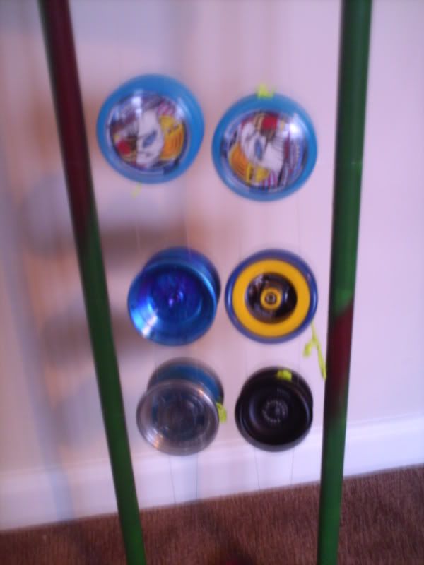
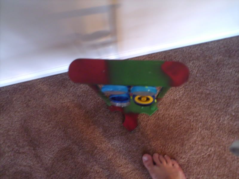
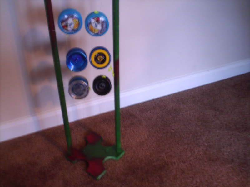
Beside being able to hold 4 yoyo’s more than the original (12 total), I think it looks better… a little more linear, and less like a box. I used a slightly different string for the picture so it would be slightly visible. Now has normal string. So, my question is, what do you think? Of course, this one will look a lot better once painted (i’ll post pics when finished) finished, leave any thoughts below. I’d also like to know what you think of the cross cut bottom, via the pole above.
I really like the first one better, but I can see how a sideways presentation would be good as well. ![]()
yeah it’s cool but I personally like the 1st one better.
I can’t really decide which one I like better. I do like both of them though.
Huh, first one’s better eh?..
i remember looking at v1 and it was honestly better looking to me. some might prefer this way. you could always ofer both
What about the first one did you guys like better?
I’ll probably offer both. What I might do, is offer the V1 with the cross cut also since it seems to be getting positive feedback.
I liked how they where all separated, and the illusion of them floating seemed more pronounced in the first version rather then this one.
also the way they sat furthered the floating illusion.
The pictures could have a lot to do with it I dunno. but I can see the lines on the second version way more and it kills the floating illusion. Plus it looks like the yo’s would stack on each other on this second version, which seems like it would also kill the floating illusion even more.
Hmm, well as a I mentioned, I used a thicker string so it would be visible for this one, but i’ll try to get pictures up with stranded string after I’m done painting. I might also play around with the angle of the yoyos. Might have to do some more prototyping. Thanks for the feedback.
The first one looked nicer to me,
Pictures updated ( I replaced the string with the normal type and painted it). Not really one of my best paint jobs, might go over it again…
i think the horizontal affected the look.
I’m going to try making another proto, I’ll post pics when i’m done. I’d still appreciate it if anyone has any comments or suggestions for this one though.
I think it would look better if they didn’t sit in stait lines. Although I have not seen it that way, so once I do, I may decide I don’t like it that way. lol
I definitely like the shape of v2 better but i like the position of the yoyos in v1
i like them both… when can we order these? are they both available?
Click the link in my signature. This particular model is not for sale, I’m still working on kinks, but the previous version is.