


Slithering Hippo’s logo is my favorite ![]()
G squared

General-Yo Badass Skull
When I read the question, the logo that popped into my head with no hesitation what so ever was Anti-Yo’s. How can a logo get a point across with such simplicity any more than there’s does? It’s timeless. I love it. That being said, I like tenyoyo’s as well. I think most people are just voting for their favorite yoyo company, not the best logo, which is usually how things go with so many fanboys. But, it is kind of admirable I guess, their loyalty.
Yup.
illustration/graphic design nerd here; hard to decide on a favorite but I think it has to be onedrops newest one.
However there are a hell of a lot of really nice bits of design out there (as well as some awful ones) and I guess I may as well explain my reasoning and try and share an objective review of some of them.
(important note; when evaluating design, favorite and best do not necessarily coincide)
for a logo to be a success in my eyes it needs to fulfil a couple of things;
-It needs to communicate the name of the company, either representationally or fully integrate text & image into one entity.
-needs to be simple and therefore memorable, preferably flat shapes (shilouette) reproduceable in monotone (the logo may appear on black & white paperwork, business cards, laser engraving, on flyers etc. etc.
-needs to represent the companies ethos or approach to its customers, product & chosen niche in the relevant marketplace.
-(specifically for yoyo companies I would count it as a plus if their logo alludes to the yoyos themselves, although this is not strictly necessary.)
anti-yo:

as said by jaf0018, this very nicely and simply unites the companies name into a memorable image.
the text is not just pasted onto the image, because its a speech bubble and everyone knows speech bubbles contain words right?
I would say the above version is a little bit busy but its nicely reproduceable in monotone:
https://encrypted-tbn2.gstatic.com/images?q=tbn:ANd9GcQbM_zL5bQcr2vGpm74oABon-ZAMng80hyvG-jE8ZIKhGQMkknE
Its because they built up enough of a brand awareness with the speech bubble that they could just use the heart icon on its own. the heart image is easily recognisable as a simpler representation of the company.

CLYW:
Now I really love clyw as a company, they are hands-on, unique, friendly and creative and this definitley gets across in Jason Week’s artwork.
from a graphic design standpoint however its a little different. let me play devil’s advocate for a second here (and I know this is their old one) but this is not really a logo:

This is an image of a yoyo with antlers, with the text ‘clyw’ pasted beside it. there is nothing that really unites the seperate elements.
now the yoyo/antler combo is a logo I guess, but its a bit complicated and unbalanced composition wise. I’ll admit that the letters do even out the composition but its still not enough to unite it as one image.
Also I’m not sure they are immediatley recognisable as antlers (i know I didnt get it first time, thought they were clouds/branches or something), and unless you know that ‘clyw’ stands for Caribou lodge you might not make the connection.
this one is much, much better:
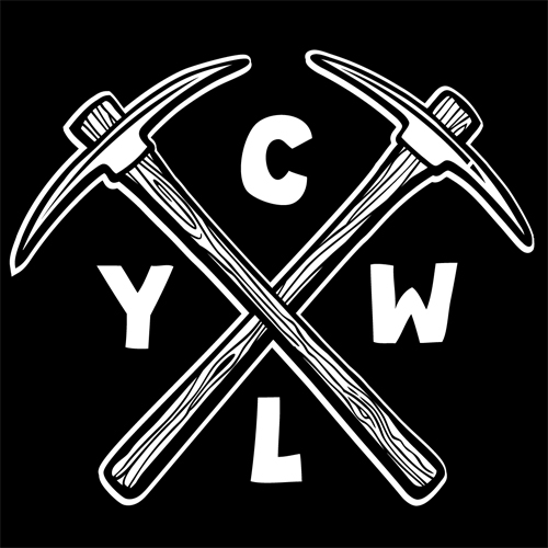
clean design, the wood texture and the fact that the axes are hand tools harks to the organic & hands on nature of the company and the company name.
the text is integrated and fits really nicely into the negative space between the axes. overall is very iconic & bold with just the right amount of subtlety.
the version without the wood texture I really don’t like so much, I understand that this one is mostly for small print/embroidery etc but its amazing how much difference it makes:

C3yoyodesign:
now its perfectly possible to just use typography as your logo, no pictures involved which I think C3 does rather nicely:

font choice in this type of logo design is very important. you can say ALOT with the way your letters look and I think theyve nailed it.
the type is smooth, precise and elegant. which is entirely in keeping with their precision/proffessional reputation, not to mention the thin C (round like a yoyo or bearing C-clip anyway) links to the thin rings machined into alot of their yoyos e.g.

the logo also works nicely in square as well as banner format
http://www.asyoyo.it/uploads/7e67cb7c31b07edf5a3c7b59b9b1bb8a.jpg
general-yo:
https://encrypted-tbn2.gstatic.com/images?q=tbn:ANd9GcRduzTFM7Q7_CZ9J3jYB7WWTsCywtzVKm7xPhqIpaUmIYjXhISGUw
not very nice, yes theres a link between the term general and the stars but you cant escape the fact that the text is just pasted on top. Also the whole branding makes the company seem impersonal from both interpretations of the word ‘general’ - generic, average and that of hard emotionless militaristic associations.
Werrd:

gonna be a bit harsh here, whatever that metallic looking W thing is its just plain ugly, complicated, very busy and entirely at odds with the wispy arty delicate typeface.
The brand is conflicting with itself, is it trying to be suit of armour like, blocky, industrial and mean looking? or is it apporachable with a hint of craftsmanship (the calligraphy)
X3:
now this is more like it
http://www.euro-yo.com/media/catalog/category/x3-yoyos-logo-200.jpg
modern, progressive, bold and eye-catching; a perfect match to the yoyos they make.
Next up, YoYoFactory:
http://img8.imageshack.us/img8/6582/yyf.jpg
very nice execution in this one, the letters form an integral part of the image, the image is directly linked to the company name (its a factory) and I love the little detail of the yoyos in the clouds coming from the chimneys.
overall pretty damn nice, the only thing holding me back on this one is its a little complicated and busy, works when seen large but gets too crowded when small.
the blue/white I think graphically speaking is more successful:

we saw the purely typographic logo for a while, once thats fully entrenched into our subconcious they can start to play with more abstract representations.
the circles version is my favorite, even just seen on its own we already know that proportion of blue to white an immediatley link to the name yoyofactory but thats not all.
yo-yo = 2 syllables
Fac-to-ry = 3 syllables.
just ‘reading’ those dots already puts the colour scheme and rhythm of the company name in our heads. very very nice bit of abstract design but only possible because they know how well known the company is.
and finally onedrop:
https://si0.twimg.com/profile_images/3348486488/61488b6497483d7394e8ee37cb7adb69.jpeg
This ticks all the boxes I mentioned at the start.
its clean & simple, Its one image that includes the letters of the company’s name in a subtle way.
the two cruves nicely remind us of the letters O and D (as in their original logo). and yes looking at it you might say it looks like DO instead but that doesnt really matter because of the symmetry of the piece, it says to me ‘DO’ and ‘OD’ equally, the abbreviation of the company is there.
Not only that, It also looks like a yoyo.
Not only that it looks like a technical drawing of a yoyo rendered in solid trustworthy looking lines which is exactly what they have a reputation for (making precise, solid yoyos)
triple whammy BAM! onedrop wins. ;D
(apologies for any excess of long words, I cant seem to help it when talking about the execution of a conceptual design proce… whoops there I go again ![]() )
)