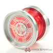
Just experimenting with my graphics guy with the Spinworthy initials I use on my yoyos.
Is that a unicorn rampant?
yeah I like its pretty sick
Yeah it’s the unicorn from the full logo.
I love this. It looks awesome!
I suppose what I want to know is if it’s better than just the plain SW.
Maybe it could be the SW on one side and the unicorn on the other?
The Unicorn from the logo is deffinitely a nice touch.
Not a bad idea. Maybe even the lion before the SW too as well as the unicorn afterward.
I’m not sold on this, I like how compact and minimalistic the SW is by itself.
Yeah me too. The elegant simplicity of the SW by itself is very nice. But the unicorn is really cool, so putting SW on the obverse half and the unicorn on the reverse half would be pretty great, I think.
I like this idea. The SW and the unicorn are really cool, but it’s a bit much together. It would be a shame not to be able to have both, though.
I like the one with the hand better than any of these.
This is exactly hat I was going to say. I like the SW by itself and I like the small unicorn logo by itself. One on each side would look great I think.
I think it has to be one or the other. I think the yoyo might be too busy with the SW one side and the unicorn the other.
I think it would work fine. You only see one logo at a time, not like they’ll be conflicting with each other. Kind of like what CLYW does with some of their yo-yos, yo-yo name on one side and logo on the other.
This is pretty awesome. I also like @zslane 's idea of SW on one side, unicorn on the other.
I could take it or leave it. The standard SW logo looks super clean as it is.
Me too. I just dont want to be doing the same one forever. I just want a minimal change to make it fresh again.
I’d rather have just the unicorn or just the SW. You could do an unicorn engraving thats about the same size of the standard SW logo.
Edit: And i also appreciate the logo being on just one side of the yoyo. It helps to know which side of the yoyo is which when doing varial and flip tricks.
I really like your SW, but I don’t like the unicorn.
