


Exactly! It has changed so much since the peak runs and its a change for the worst. I just dont like the sky blue. Another one I hate is the sky grass by onedrop. It’s basically the exact same as the 28 stories but with forest green instead of red. I just hate sky blue and silver acid wash I guess.
I may like some colorways better than others, but heck I wouldn’t complain if someone gave me a yoyo with a “bad” colorway, I will always be grateful for my yoyo’s and people letting me play with their weird colorway throws ![]()
I hate dogfish creek colorway.
I like 28 stories, and I own the grey w/ gold splash supernova and it looks great…
The orange with the red acid wash on the super nova is terrible actually anything with orange is terrible I just don’t like it
Thats my favorite colorway! At least on the Cascade… it looks a little different IMO.
I feel like MFD is so good at anodizing they sometimes do things they shouldn’t… its cool they can make a yoyo look like that… but it’s pretty ugly…
Ya the colorways vary from yoyo to yoyo but I just dont like the sky blue. I bought a sky grass code 2 and after having it for less then a day I traded it away.
Personally, I love that Amplifier colorway.
Anyway, I don’t really like the Crucial Cupcake: gray with green and brown splash. Also, I love most of the Square Wheels colorways, but I feel like some are a little overdone. Lots of MFD’s colorways seem way to cluttered.
Don’t even get me started on that Yomega Glide plaid colorway.
ARE YOU KIDDING? THEY HAVE SOME OF THE BEST! kikazaru is amazing! So is mizaru!
On another hand, black. Pure black, or half black tends to be hated by me.
I hate the SN grey with gold splash.
I hate all colorways that people find more rare or expensive. Color is color it’s easily blasted off and given a new paint (anno or powdercoat) job. Other than that most brown, yellow and orange yoyos disgust me unless they’re done right.

Grey with green splash is Dogfish Creek. And it is absolutely beautiful.
1 Like
I love Dog Fish Creek, but I really dont like 28 stories
Agreed.
I don’t really care for any yoyo where the splash/acid wash/whatever looks way over done. The kind of design I like is like on my coals edition Campfire, it looks sick when and when not spinning. As for solid colors, I dislike “butterscotch” colored yoyos and I’ve always kind of disliked solid gray too, just a personal preference.
I have a 2nd run 28 stories Peak and it is so beautiful. The new runs of 28 stories are so far removed from those first peaks. I would love to buys more CLYW in the 2nd run peak color way if I could.
Agreed!
Exactly dude! It would be my favorite colorway if they did it like the peaks. On a side note im getting burnt out on the colorways coming from clyw. Yes they drop a new colorway pretty often buy im mainly talking about all the variations of the blizzard. Enough with the blizzard, if I dont ever see another gray speckles yoyo I wont be sad. They have so many awesome colorways from back in the day. Please bring back some of those AND FOR THE LOVE OF GOD NO MORE GREY SPECKLES lol.
I’m going to go out on a limb here…
but I really don’t like the Hulk Smash colorway.
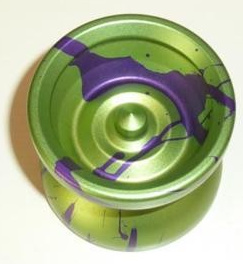
Most of my throws are either green or purple, as they’re my favorite colors… and I really like green + purple… but I don’t know what it is but I never liked the Hulk Smash. Maybe it’s the weird green color? I don’t know, but I think purple with green splash would have looked much better.
I think hulk smash is pretty sweet. I’m not crazy about the Wolverine color way.