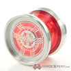
i think yyf champion series is some of the worst uninspired graphic design ever put on some yoyo. could have pay someone $10 on fiverr do better job. truly pathetic way to celebrate your historic champion yoyoer
Always a beacon of joy and positivity.
out of curiosity why was it so hard to not crap on something that someone else likes? i mean was voicing your negative and condecending opinion truly necessary?
Agreed
I’m pretty sure he was joking?
Looks like an homage to a NASCAR lol
oh, sry, if scoog was being sarcastic that flew right over my head
not really about “liking” you so much as your typical responses are frequently rude and condescending
because i said i do not like tight bearing seat on non USA yoyo, and said it is nice if people keep prices on BST post so we can reference later and some people personally attack me for my opinion?
ok lol
anyway,
here my favorite design ever
Original Jason Lee 888 !!! ![]()
![]()
![]()
![]()
In terms of colorful anodizing:
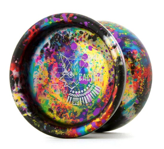
C3 Bastet 2 from the 2021 Lucky Bag
Doesn’t get cooler than this (pic by Rewind).
Jason and Vendetta are my favorites of all time. Love monkey finger and G2 as well. So many other good ones as well
when that yoyo dropped, i knew i ahd to have it lol. its so much more beautiful in person than photos can do justice.
Legit a mesmerizing colorway.
yooo thats sick!
My cycling-heart just jumped a bit. Isn’t that something?
It’s so awesome to me that people love the basic simple core-shape of a YoYo so much, they make a spoked one.
