


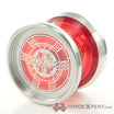









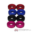


Unlike the speed maker and phenom that just got new caps, the Phenomism is being completely redesigned.http://img.tapatalk.com/d05dbd47-1124-dedf.jpghttp://img.tapatalk.com/d05dbd47-1135-ca36.jpghttp://img.tapatalk.com/d05dbd47-1144-4f6e.jpg
Interesting. Looks like it’s taking some design cues from the sfx. Do you have any info on what exactly is changing? Price drop? Bronze or aluminum weight rings?
When did you get this and where did you order this from?
Man, this makes me glad I bought all my Hiroyuki Suzuki signature throws before he and YYJ parted ways and YYE stock was replaced!
I think all I need is a Speeder and I’ve got the entire set! Just want one with no cracks and both caps. I’ll supply my own bearing!
why does it looks like a YYJ Destiny?


Hmm… looks like the phenomizm caps fit nicely in a destiny
Hehehe… Is that a destiny with phenomizm caps you got there?
As Preinfalk has already mentioned>>> and backed up by me(from Yoyojam), that is a Destiny(older colorway by the way) with Phenomism caps. Nothing more, nothing less.
Nothing wrong with the yoyo; just a silly attempt at ‘silly’.
People are Ka… razy.
1 Like
That’s what I was thinking:
Destiny with Phenomizm caps.
Hope you didn’t pay Phenomizm pricing for it! The Destiny is cheaper!
Yeah, it’s a destiny. Sorry if any of you took this too seriously.
Hahah, it’s cool :D. At first I was like…that can’t be. And I start doubting myself when I saw the original caps with Mickey’s name on it.
Ever since Mickey left YYJ, the text/font on caps of new runs of Mickey’s old signature models have…in my opinion…looked uglier.
I have to agree with the caps not being as nice on the new issued throws after Mickey left. Starting with the Phenom. Thank goodness I got mine in November 2011.
Dave Bell and the good guys at YYJ should have at least kept with the font design because that worked best. Sure, they design and produce great yoyos, but when it comes to cap art it’s just bland. Like, I can’t take it seriously anymoar. Like…the face value of the yoyo just went down just because it’s not aesthetic to the eye anymore.
I’m glad I have a deal with a friend to score a PHENOM and PHENOMizm when Mickey is still with YYJ :]
I got my Phenomizm in December, a month after getting the Phenom. I’m wondering if Mickey had some rights to the font because I see the same kind of theme on his new stuff on YoYoAddict brand merchandise. Might be some copyright issues at play here as well as intellectual property.
I bought a Speed Maker at YYE last week. I wanted to ensure it was the OLD caps, not the new ones. Fortunately, my color choice was the older caps.
In the meantime, I feel Mickey’s new stuff is over-priced. I love the way it looks though, and his designs work very well for me. The Speeder 2, Chaser, Phenomism, Phenom and Meteor are among my favorites.
I don’t think that’s the case. I’ve seen that font around lying in the Internet. I just can’t remember where. I don’t think Mickey has exclusive rights to that font he used. But I’m still going to stick with the lack of aesthetics on the new cap art.
Nice! Lucky you! Get that Speeder2 soon to complete your collection! Or so I recall that you still dont have it.
As for his yoyo prices, keep in mind that the USD-Japanese Yen exchange has a role to this. But I also read that he’ll be releasing a full-sized throw with economy in mind. He markets it as “your very first metal yoyo” so I’m guessing it’ll be very cheap. he said it’ll be between 5000-6000yen. So about $61.
Read up. I do have the Speeder 2. It’s also on display in my big “blue yoyo collection” shot for April 2nd’s Light it Up Blue thread in General Discussion. All I want now is an original Speeder.
Regardless of who owns the font, we’re both in agreement with the artwork on the caps. Too boring now.
I can’t wait to see what he can come up with in an affordable metal throw. Hopefully he can release the metal chaser prototype as an economy metal.
I think micky just take whatever his when he parted with yoyojam.
Maybe, he design the cap, so yoyojam, in order to respect micky, don’t use them anymore.
I feel this because one of the older speedmaker caps has micky family stamp as the design.