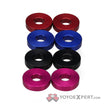
its my second sig and i love it!!! please be constructive with critisism
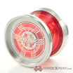
instead of metal yoyos in the sig it should be plastics, unless youre showing the metals being burned, melted, etc.
i was gonna blur them on the edges to make them look like they were melting would that work?
yea, that would look sweet ![]()
how bout now there all burned and crisp lol!!! that 888 used to be blue
make flames coming off them
oke dokey!!!
The logo is TINY.
I’ll fix it!
I’m a day late and a dollar short here but I think there is way too much going on. Its distracting.
1 Like
A sweetness idea, but it looks choppy, as if the fire isn’t really there (I know that it’s not but still).
