Hey everyone! A bit late on this but Alpine dropped recently on Yoyoexpert, I wanted to share the design process here and also create a thread that allows people who have questions or comments I could reply to directly. This is lifted directly off of my website (which is why it might sound weird at times when I refer to my past writing) but I know there are a lot of Yoyoexpert peeps who enjoy reading on the forum. I remember the days where I would right content on Theyo - hopefully I can provide a similar experience going forward.
I never got a chance to reflect on the past year with a blog post - I wrote one that involved the future of Luftverk and what I wanted it to look like but I didn’t feel comfortable making it public yet. But the space that Luftverk has occupied in this niche industry has changed so much in the past 6 months - When I first started this back in 2015, there was nearly no one who was consistently making titanium yoyos. Today, there are a slew of new companies that customers can choose from, seemingly releasing titanium yoyos on a weekly basis. It makes me excited that titanium yoyos are becoming more widely accepted. I find myself putting more weight on doing collaborations with brands or friends that I think provide a level of value in the community - I was excited when CLYW reached out again.
Steve from CLYW emailed me in March 2021 for our third titanium collaboration. With covid in full swing, I knew it would be a logistics nightmare. Previous month I paid over $1500 just to ship foam for my own Luftverk packaging - I was worried if we did a larger run it would cause some issues. But we worked out a system where if CLYW could provide help with their established shipping, fulfillment and packaging, I could focus on the machining/engineering side of the project. With the larger tasks established, Steve and I put our efforts into figuring out the direction of the design.
Looking back at our two previous collaboration yoyos there were very clear intentions with each design. The Tundra shared a lot of elements from the Octavia which made the entire yoyo feel extremely Luftverk like. I felt like since I was such a new brand, i had a level of insecurities of making a statement instead of just making a CLYW clone. The lines on the Tundra were very hard and even the outside defining profile groove that CLYW is known for was stylized in a Luftverk way. Our second collaboration, the Peak, was the one I felt like had a level of novelty. The play of that yoyo was heavily lacking compared to a modern throw. We spent a lot of time making it feel nostalgic, and while collectors loved that yoyo - I didn’t think it was the best yoyo from a technical performance standpoint. It didn’t matter though, as the nostalgia factor was enough to forgive its dated feel. It was the yoyo I knew I could never top - it was a titanium OG peak after all.
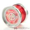
The name Alpine was also indicative of its DNA shared with the Tundra, perhaps a “Tundra 2” even. The Alpine shares a lot of similar lines but in these photos you can see what I mean when I describe the Tundra as having more “Luftverk” like features. The lines are more sharp on the Tundra whereas on the Alpine, the lines feel much more “CLYW”. These changes also translate over to play style. The Alpine definitely feels more floaty and full, with its wider width and weight distribution. But the original inspiration for the design actually didn’t directly reference the Tundra, since when you hold them in your hand they feel very different.
During the time that Steve reached out to me, I had just finished designing the Otter with Harrison Lee. Working with someone so competition focused was a refreshing challenge. All the things he wanted were from such a technical standpoint (extreme stability, spinup, bind tightness, what combo he could hit, ect), it translated heavily when I went straight to work on the Alpine. I had never previously designed a titanium CLYW with this in mind. The first iteration was actually much like the Otter, but after Steve gave some insight on some of his favourite yoyos, it slowly morphed into what you see here. It’s a huge reason why i love working with someone - bouncing ideas off someone is a refreshing break. The hub area was originally completely taken off of the Bonfire. Then I tried the Manatee (one of my favorite looking CLYW yoyos, fight me!) and Narwhal hub. The issue with those, is that in titanium it added like 4 grams at the hub which I knew would hinder the performance and feel. It sat in a limbo stage until Steve mentioned how much he liked the classic “machinist” style engravings that I have been using on a few of my slimline yoyos. I didn’t originally think it would work well, but with CLYW’s cabin feel it actually tied it all together very well.
The final inspiration was heavily mixed with CLYW yoyos. The outside area that your palm hits, as well as the entire dimensions was initially taken off of the Chief. This set the tone and feel for the entire yoyo. The double lip was taken from the Scout but as we made prototypes it slowly got smaller because it needed more rim weight. The faint ghost line near the catch area was taken from the Borealis and of course a reference to the Tundra, a nice homage since it is a continuation of the titanium line. And finally the hub was lifted from recent classic Luftverk yoyos, but with a more rounded nipple. I tried to use the sharp edge version but it felt wrong since the entire yoyo only had softer CLYW style lines. With all this inspiration, the hardest part was to make it feel right.
I have gotten to the point where I can look at a design and know how it will play (At least in titanium, aluminum I still struggle lol). Incorporating all these CLYW visual design elements was a challenge since changing the lines to make it play the way I wanted to also meant changing those elements which then looked weird and un-CLYW like. It was like a balance beam on a marble that kept getting away. I tried to trim weight in the hub, but then the proportions started looking nothing like a CLYW yoyo. I would try other hub elements that looked amazing, but then realized I took them off of an aluminum yoyo and it would add way too much weight when done in titanium. In my head, if the Tundra was the more Luftverk yoyo, I wanted thi to be the very CLYW looking and feeling yoyo so it wasn’t something I wanted to sacrifice.
As far as the play, it was where I think I contributed the most on. After Steve verified he liked the aesthetics and direction of the project, I went to town tweaking the weight distribution. There is something to be said about the feel of mid-weight on CLYW yoyos - they always made the yoyo feel so satisfying to throw. With yoyos like the Chief, the double ring design added midweight that made the yoyo spin up easier. And while from a sheer performance perspective, having everything on the edge does make the yoyo more stable but has a resistance of spin-up during the throw. That uncomfortable kickback feeling is a byproduct of having too much rim weight. The mid weight helps the user easily introduce energy into the yoyo easier - this can be felt heavily the Alpine. The CLYW pads have always provided a tighter bind too, which contributes how the yoyo feels when unwinding, allowing all the energy of the throw to be translated into rotational energy right up to the bottom without that annoying “thud” feel. These were all the details I focused on after receiving the initial prototypes. The feeling of the yoyo was completely transformed after the second round of tweaks - with the biggest change being a one gram reduction in total weight by reshaping the mid-weight second lip. These provided a very pleasant change in the play characteristics. I always surprise myself how much all these years of designing yoyos have helped me diagnose “feel” issues with yoyos. I definitely treat it like an art more than a science.
The certificates were designed based on the Peak “3D Exploded” technical drawing, with updated details like the ghost background I have been doing for Luftverk releases. I think these are details that indicate the slow evolution of the Luftverk brand. The minimalist branding of the Pickaxe “LFVK” logo was continued on the outside of the box. This aspect was a little bit of a challenge with the restraints of the CLYW fulfillment method, as I didn’t get as much control over the printing and packaging. With Covid in full force, the box stamp was delayed for over a month. I was lucky enough to find a local stamp place in Toronto, and over nighted it to USA where the packaging and fulfillment was done. Thinking back to the other CLYW colabs, I never thought I would be navigating a global pandemic during this one. But once all the hiccups were ironed out, I was sent the final production units, where everything came together.
As mentioned earlier, I decided to incorporate The “machinist” style Luftverk engraving. It was first introduced on the Daytona back in 2017. I wanted to replicate how Tom Kuhn incorporated text into their yoyos back in the day but as my brand grew, so did this style of engraving. The engraving pad expanded in size, allowing more text and more surface area for typography. This peaked during the release of the Alpina, a yoyo that I coined as something a machinist in the 50s would have on his desk. I knew Steve was a huge fan of this style of engraving likely because he also found a level of nostalgia from being in the yoyo community for so long. The term “Return Top” has been used by so many Canadian brands now, but was originally coined by CLYW since the word “yoyo” is a trademark in Canada. It’s a subtle nod to the history of CLYW that likely few remember.
Every release I have tried to focus on something different but with the Alpine, it is a less tangible effort. I hope this blog shines light on the long process this yoyo had in order to reach production. I will take ownership of the feel and play of the yoyo - something that could potentially be controversial since its so opinion based. Looking back, the Peak made me feel a great amount of pride hitting that nostalgia “collector yoyo” factor. With the Alpine, it is the yoyo I actually enjoy playing with that can hit my more complicated tech combos. The feel, spin-up, and dimensions all check off important aspects of a staple flagship CLYW yoyo. But with the tweaks I added - I hope it can surpass their aluminum counterparts. My wish is that these efforts can also be felt by whoever decides to support this project. Huge thank you to CLYW for the opportunity and love.
