


Hello everyone, I’m Joo. It’s been a bit over 3 years since I started yoyoing and from the very beginning I have always wanted to design a yoyo myself. That dream finally came true and I wanted to share every moment I’ve gone through with you guys. Today I received 4 different prototype models each with a 5 unit run, designed with the help of many different community members who I’m very thankful towards.
Before I go through with this, I wanted to thank the people who helped me through this process.
I want to first thank Jordan Blofeld (@chaosgow) of OPYoyos who kickstarted this process. He helped me a ton during my initial design process. He’s a great guy and I encourage you all to go get some OPYoyos for yourself since they are amazing and designed with a lot of thought in mind.
I thank Tyler Hsieh (I don’t know if he has a YYE Forum tag), the man behind UNPRLD. My very first yoyo that I started out with was a pair of UNPRLD yoyos and my design took a lot of inspiration from their yoyos. Tyler was so kind to provide CAD files and info that ultimately helped me design these yoyos.
I want to thank @MaximShoots, @Aridnavleez and @hobbygod for coming up with a yoyo that inspired me to commit to making an extra model heavily inspired off of their design. I will go into more detail when I introduce the models below.
Prologue. Shape, Dimensions and Materials.
- Dimensions
I am primarily a slack tech player who’s very much inspired by players like Takeshi Matsuura, Tsukasa Namba, and William Chow. I am a big fan of Turning Point yoyos primarily due to their narrow and heavy yoyos. I took the Takeshi signature yoyo lineup (especially post-colony era signature yoyos) to heart and decided to adopt that general shape. Below are the yoyos I took inspiration from when I was designing my yoyos.
I am a huge fan of the OG Mustang. The Mustang has been my favourite yoyo for a long time. It’s not the best performing yoyo by any means, but I think it strikes a great balance between performance and general playfeel. With a 56mm diameter and 42.5mm width and 65.9g weight, I felt like it had enough power for me to not leave me wanting more performance, but felt abnormally light which I loved. Something about it felt magical to me, and I really wanted to keep its properties.

The Turning Point Leviathan 7 took me by surprise when I got it. I already owned a Ziz after I got a Hinemosu thinking that the smaller diameter would help me land chopstick elements and it turned out to be true. After that I owned a Cetus and moved onto the Leviathan 8 to “finish” my lineup.
Then I happened to purchase a Splash colourway Leviathan 7 for a bargain on the BST. I initially planned on selling this off quick, but once I played with it a bit, I fell in love instantly. I’d say it goes hand in hand with my Mustang among my favourite yoyos of all time. It has similar properties to that of the Mustang. Just enough performance with a very crisp feel on the string that moves very well and light for its weight. Once I looked up its specs and found out that it weighed 65.9g just like the Mustang did, I knew that this was the weight target I had to hit while designing my yoyos.

Even if I liked the Mustang and the Lev 7, something wasn’t quite perfect for me. The 56mm of the Mustang felt slightly too large for my teeny hands. I thought something slightly smaller would suit me best. However, I felt like the 53mm of the Lev 7 was a bit too small, making rejections happen too easily and feel somewhat unpredictable at times. From my personal experience, smaller diameter yoyos tend to reject easier, and although I appreciated the easier chopstick elements from smaller diameter yoyos, I didn’t like the unpredictable nature of rejections that small yoyos often bring. So I decided to design a yoyo that would fit the middle ground and make a yoyo with a 54.5mm diameter, with the same width I love so much, 42.5mm.
- Cap
I am a huge fan of Daniel Kim. I personally think he’s one of the most creative yoyoers out there. When UNPRLD announced his signature yoyo, the Motif, I just had to get one. I’m not gonna lie, I’m not a fan of V-shaped yoyos and back when I purchased it, I was of the opinion that any yoyo that isn’t focused on performance would inevitably end up being a disappointment. The Motif being a capped design, I was quite doubtful and I honestly just bought it as a Dkim fan.
However, once I received the Motif, my opinion took a 180 turn. Sure the Motif isn’t a performance monster, but it brought along a unique playfeel that I’ve never felt before with any yoyo before. I have tried light and heavy V-shaped yoyos, organic yoyos, as well as rounded H-shaped yoyos of various weights. Nothing had the characteristics of the Motif. If I had to describe the playfeel of the Motif, I’d say it feels like a metal balloon, which it technically is. The caps make it feel exceptionally light, and for some reason it made me finally realize what “floaty” actually meant as a descriptor as yoyo feel. I’ve tried various organic yoyos but the feeling of “floatiness” was somewhat mild until I tried the Motif. The Motif is crazy light, floaty and just plain fun to use. I wanted to use this cap design, which also looks great with its convex shape.

- Response Area
My first ever yoyo was the UNPRLD Nostalgia. Actually, my first yoyo was supposed to be the UNPRLD Disruption, but during COVID, the production got delayed and the Nostalgia which was planned to release later happened to finish its production earlier than the Disruption. UNPRLD notified me of this and sent an email to any Disruption preorderers that they’d be willing to ship the Nostalgias instead of the Disruptions if anyone was willing to do so. Being a noob, I just said yes since I wanted a yoyo asap, and I wasn’t picky about my choices.
Funny thing is that they forgot about my email and my order ended up being delayed even further. After sending them an email, they apologized and told me that the second run of the Nostalgias were coming soon and I’d be able to get them soon. @ColinBecko made everything right and went above and beyond by adding a raw Recog on top of my Nostalgia as a token of apology. I was very grateful for this. In the end, I ended up with 2 amazing yoyos as my starter pair. The Nostalgia, even if I don’t have it anymore, is one of the best yoyos I’ve ever played with even after all these years of trying various yoyos. The Recog is in my opinion, the best monometal to have ever existed. I’m so grateful of the UNPRLD team for going above and beyond their customer service.
The Nostalgia is a V-shaped yoyo with a wide width. Admittedly it’s not my favourite kind of shape or dimension that I prefer. However, there was something I really enjoyed about its design: the response bump. The Nostalgia has a little bump around the response area which I assume was added to minimize friction when the string goes off alignment. Something about this response bump was magical to me. First of all, it’s among the best response bumps for finger grinds that really allowed the yoyo to spin for a long time even on the finger. Also, the binds were very very satisfyingly tight on this response bump. It was simply my favourite response bump design I’ve ever tried.
I emailed Tyler Hsieh about this and he happily provided me with the response bump files of the Nostalgia. I kept the response bump design the exact same as the Nostalgia to preserve its properties.


Now that I had the shape, dimensions, weight and cap design in mind, I could finally start the design process properly. Below are the four prototypes and what went through my mind as I designed them. All four designs have the same shape, but slightly differ in weight. I will go into further detail in each of their sections.
- Materials
Since I had already decided to get my prototypes manufactured by FPM, I decided that I wanted my yoyos to use 7068 alloy aluminium. I’ve always wanted Turning Point inspired yoyos to come in 7068 aluminium due to its advantages in strength. I thought it would be great if I could fulfill that prophecy myself. I decided to have the body and caps manufactured with 7068 aluminium.
- July


This is the monometal version of my design, and also the first design I ever worked on. I called it July because first of all, my name is Joo, so it was a great pun. Jokes aside, This yoyo was conceived on the 2nd of July when I was talking to Jordan (@chaosgow), which happens to also be my birthday.
I initially gave Jordan my ideas and asked him to design a template of which we could work with. He did a phenomenal job of tracing the Takeshi sig shape, the cap and the Nostalgia-esque response bump. The total weight came out to be around 66.3g. I initially planned on having a very tall nipple since I loved the 16mm axle of the St. Elmo so much, but since the cap was already there to increase centreweight a lot, I decided that Jordan’s suggestion of going with a more conservative bump just enough to accommodate a 10mm axle was enough. As a result, the nipple is shorter than the Elmo.
Jordan proposed a slightly stubbier response bump since he said that adopting the Nostalgia bump outright would make it ugly with the current proportions, but I ended up being stubborn and edited it later to have the same response bump as the Nostalgia. I thought that even the smallest changes would make it behave differently and I didn’t want to risk that personally. I edited in the Nostalgia bump, the general shape Jordan drew for me, and edited the files to lower the weight from 66.3g to 65.9g.


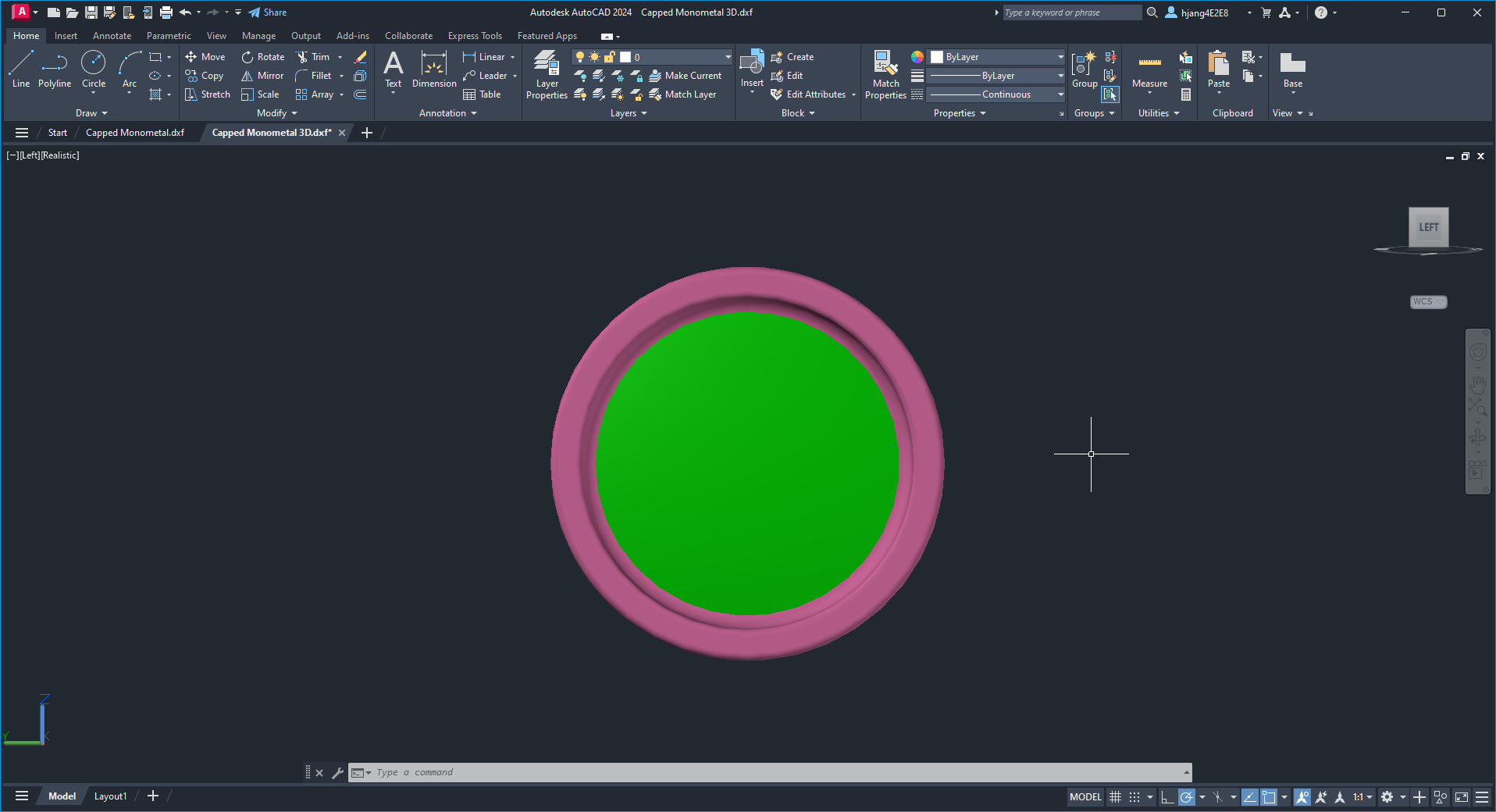
And thus my first design was complete.
- Jubilance


This second design was a more ambitious design that had me fueled off the high of finishing my first design, which is why I named it Jubilance (Also totally not a Joo pun). Since I’ve always preferred bimetals over monometals, I wanted a bimetal adaptation of my first design. I immediately got to work.
Since using Stainless Steel rims required me to cut weight from other parts of the yoyo, I had to start carving out the inner area of the yoyo immediately since I wanted to keep the shape between different models consistent. The walls and caps were already nearing their limit in how thin they were without compromising durability, so I decided to adopt a design element seen in the Motif.
The motif has a small “canyon” right after where the rim ends.
I wanted to use this design element to my advantage in order to carve out some material to make room for the new steel rims. I ended up with the following shape:

As you can see, I carved out a canyon and offset that to the rim area. This was challenging since the use of caps severely limited the capability of weight reduction. I wanted to keep the cap design the same, so I only had so much room to work with when I was carving out the rim area. Still, I did my best to do so and ended up with a SS bimetal design.
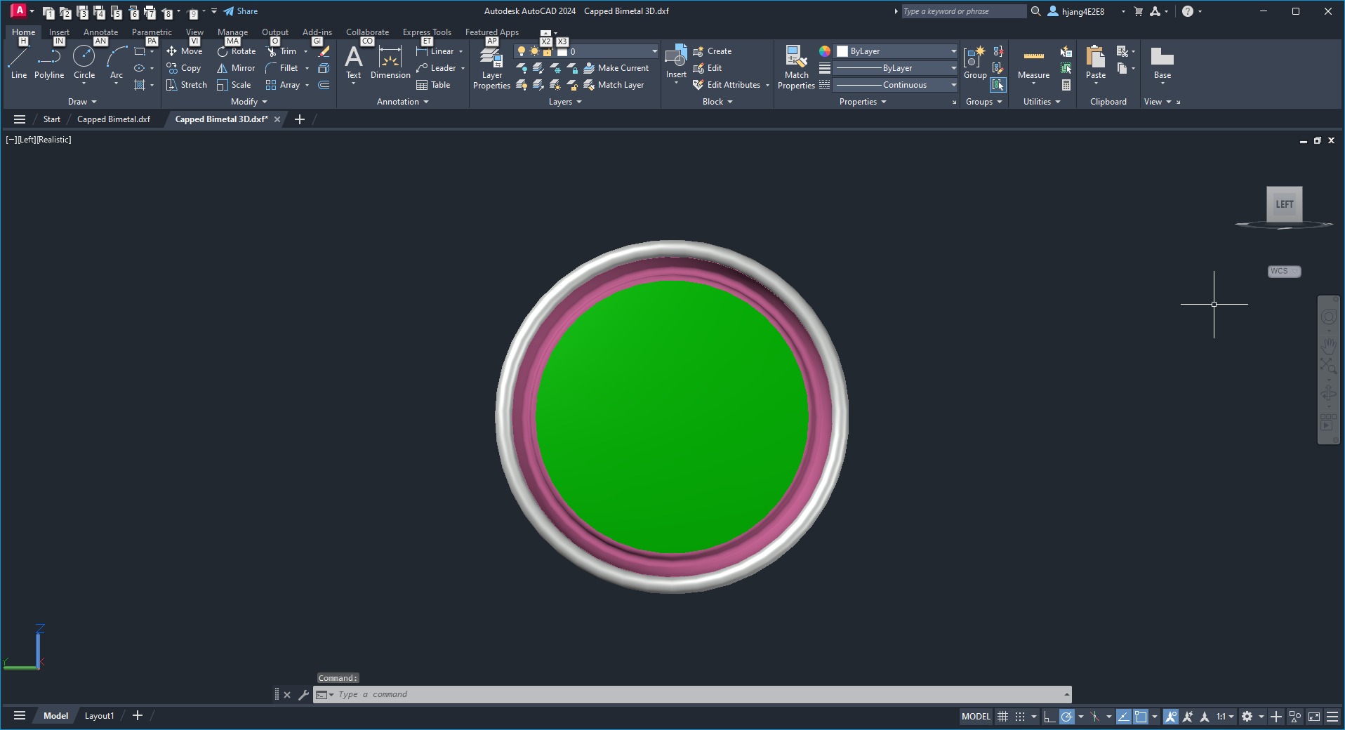


The resulting weight came up to be 66.6g. I really wanted to keep the weight at 65.9g however I didn’t want to compromise the durability of the yoyo too much. Carving out more from the canyon meant that I would end up with even thinner walls which would end up being weak points in which the yoyo could break or bend. I was a bit conservative with the structural design and decided that I would rather keep the durability high even at the cost of more weight.
- Juvenility


This yoyo, well, is kind of a “mistake”. Or rather, it’s an immature version. As you can see immediately, it’s ripping off the design element of the Edition Yoyos Aspen (Btw, go buy the Aspen here: Aspen (Pre-Order) | Edition Yoyo). Since it was an immature design, I decided to name to name it the Juvenility (I swear it’s not a Joo pun). The Aspen is the signature yoyo of @Aridnavleez and a much much much more well thought out design. They already have prototypes which they are happy with. They also use grade 5 titanium compared to my grade 2 titanium prototypes, so it’s superior. Go buy it and support my homie @MaximShoots.


I’m sad to say that this design was ordered before it was truly finished, since I ended up coming up with a new design that integrated my previous design philosophies in conjunction with the aspen style integrated rim/cap design. This is why I named this model the Juvenility since it was underdeveloped.
When the Aspen released, I was already obsessed with capped designs so the use of titanium to integrate the rims and caps into one part seemed genius. I wanted to experiment this design element for myself and decided to adopt it. The thing is, when I was ordering the SS bimetal I mentioned above, I kinda ordered this design impulsively. It was definitely an underdeveloped design, since I haven’t changed anything from my initial inspiration, and also I may or may not have been drunk when I decided to chuck money into this project, which ended up being fueled more through impulse over reason.
Either way, it was a great experience working with titanium in CAD and I ended up with the same shape, with my target weight of 65.9g.


- Conjugation


This is the last design I worked with during this project. I named it the Conjugation because in biological terms, it describes a process in which unicellular organisms exchange genetic material with each other. I thought it was fitting since it was a culmination of my previous designs with the design element of integrating the rim and cap into one part using titanium like how Edition did (Okay, at this point it’s clear that it’s a Joo pun).
This design came around a week or two after I ordered the previous two designs. A few days after submitting the order for the Juvenility, I had the idea to integrate the convex cap and visible rim design as well as the integrated Ti cap/rim element all in one.
I decided to keep the convex cap design and make sure that the rims were exposed. I also made some adjustments to make sure the interface between the rim and the body was making good contact for structural integrity.
This resulted in slightly increased weight over the Juvenility, but I didn’t mind this much since by this time, FPM has been sending me updates showing that they have been drilling small holes through the nipple of the hub in order to make sure that the caps were installed well. Since I knew that there was going to be a small amount of mass being lopped off the total weight, I was happy with the total weight coming out to be 66g flat, which I assumed would be offset by the holes being drilled through the middle.
In the end the final result was this.


==========================================================
That’s the end of my yoyo designing journey. I don’t plan on making more yoyos in the future unfortunately. I have more career related matters to attend to so I cannot afford to spend more money in this hobby.
Either way, I hope this post provided some entertainment or some sort of help in terms of yoyo design. If anyone has questions regarding yoyo design I’d be happy to help.
I’ll be posting extras soon and they will be very limited in quantity. Feel free to DM me once the BST post is up.
Either way, I hope you all have a great day. Happy throwing everyone!