Yes, I’m married to the font.
Kids? jj.
The Harbinger, Boon, Ballsy, Burly, Stout and another on the way.
Skinflint?
Yes! That one too.
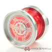
I also thought flower when I first saw it, and I suspect people who didn’t see the evolution and large image might think the same. Raising the cross (like 1 of 4 on the most recent comparison) makes it look less like a flower, and more definitively a Christian cross. (I don’t know what you’re going for. I like the tall cross personally.)
I love this thread.
When seeing it evolve I know what it is. As I scrolled and seen it on the yoyo it looked a little cluttered and at first glance saw a little tree or flower. Not a bad thing but certainly the first impression I had. The first one out of the four would probably separate better when on the wood and look distinctly like a cross.
I want to like this more.
Here’s a weird thought:
Make the applied logo LARGER. Place the unicorn in the “W”?
Also, I want that “trialogo” yoyo.
Also, that’s REALLY fun to say…
I like the cross with arms, but I’ve decided just to keep using the original at this stage.
To be honest, I don’t like anything I’ve seen here as good as the original. It’s just very good.
yeahman, i’m with gfe… i’ve done some graphics work myself in the past. sometimes less is more…i’m not an expert either
