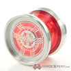
I noticed it when it came out but haven’t really heard much about it, anyone have any experience with the YYR Helvetica and Futura?
They’re 6061 yoyos with uninteresting shapes for over $60. Not worth it imo. Kind of the case with most of the stuff in their “budget” lines
Lol, yoyorecreation and turning point are the biggest examples I point to when talking about yo-yos that you can get from other companies for cheaper. Like at least with something like A-RT you’re partially paying for an idea and process, and it’s a unique product from that perspective.
With YYR it’s like okay but I can get a Singularity or a Hummingbird.
I still see their flagships as the best in the world though, even if by a small margin, so I think they are worth it if you have the money. Including TP Ti’s. But their budget lines just make me think like. why.
I think the typeface series looks great!
So clean and classy!
I guess I’ll just have to try one myself somewhere lol. It’s the best way to gauge a yoyo anyway.
I am interested to hear from anyone who actually has one as well? As a graphic designer I have Helvetica playing cards and future coasters and Pantone mugs so am very interested to hear about the yo-yos?
I’d love to see more being done with this theme. Someone mentioned a Comic Sans. I’m thinking a yoyo with a bunch of curves in a organic-h shape. Times New Roman could be a more angled w with less of a step than their futura but with more eges in the cup or something since it’s a serif font.
Or something like that
If it’s anything like the font, a comic sans yoyo would be the one that makes everyone immediately dislike any trick you do while using it.
I have a futura that I got when I bought a bunch of yoyos from someone. My main impression of it was that it was kind of uncomfortable to throw, too sharp. Other than that I think it played well, super smooth, nice blast and everything else you’d expect from a quality brand. Unlike every other YYR I’ve tried, there’s nothing to make it really stand out. I’ve not picked it up in a long time. It has the misfortune of being stored with my other YYR throws, so anytime I want to play a YYR its not the one I go to.
That is the DV888
I ‘am certainly not a graphic designer’. I am not a lettering expert. And; I am guessing that I don’t have a very good imagination when it comes to making connections between certain things…
But I have zero clues about how those 2 typefaces having any similarities to the 2 yoyos mentioned?
I don’t see it at all?
I would really appreciate if anybody else on this Forum; would do me a favor and give me your view on how the Helvetica and Futura typefaces can be represented by the respective yo-yos?
Futura is a sharper font, whereas Helvetica is a smoother rounder font.
Both of these characteristics can be seen in their respective yoyos.
At least that’s what I think.
And probably a half dozen other typefaces could also be seen in either of those yo-yos; also.
Did you ever hear the story of Mike and Ike?
They were identical twins. They were exactly the same; only different.
One was the Worlds’ tallest midget.
And the other was the Worlds’ shortest giant.
Amazingly; they were both exactly 9 feet tall.
![]()
…The point being…they could have easily passed on the Helvetica and Futura typefaces and picked 2 others that could ‘also’ be seen in the respective yo-yos.
I’m gonna come out with my own yoyo. It’s going to be modeled after a fat apple pie.
It’s gonna be round… and wide… with crust colored side caps.
Okay mate. I was only trying to explain it as I understood it to mean.
you’re definitely correct about this, but perhaps YYR chose those two names in particular cuz they’re two font names that the general public is aware of? ![]()
Given that it is a real stretch to connect the shape of a typeface with the shape of a yoyo, I think YYR could have chosen any two typeface names and it wouldn’t make any meaningful difference. Saying that these yoyos “look like” their respective typeface letterforms is the same exercise in imagination as finding distinctive shapes in clouds.
As much as I love typefaces and really wanted these to invoke them, I just don’t see it. I mean you can tell which is which, but beyond that they don’t do much for me as far as looking like the fonts typefaces. It’s a cool idea, but just hard to pull off.
[pedant_mode]
typeface: refers to a complete family of fonts of the same name and design (e.g., Helvetica is a typeface).
font: refers to an instance of a typeface with a specific size, weight, and style (e.g., Helvetica Bold Oblique 9 point is a font).
[/pedant_mode]
Thank you. I share that pedantry and try to be careful about it, but I’m just not very good at things.
Ahh, I didn’t know that. It’s kind of like “make” and “model” of a car then?
