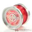
Way over the top is the best way to work with kitsch and gaudy symbols imo no doubt and that’s what I like about this mowl Yoyo like kinda post modern it’s sick lol omg can you tell I studied the arts hah!
See, I think it looks great!
I agree its not bad, but its something with the weird teal color…
Mark Gonzales can´t draw.
But he has a unique style and character. He is definitely an artist.
But he can´t draw.
I agree with the top, but I own the bottom one and like it.
Sorry. If you like it, I´m not going to say anything more negative about it. Enjoy.
No problem, I wasn’t offended. Everyone has their own taste!
I love the look of that one on top. To each his/her own, though!
I think it looks cool. Imo, the colorways are probably the best thing about the Outlier 3. Aesthetics are subjective, though.
I hope I don’t get banned for this but I could see nicknaming this milky white version of the skyva the skeetva. ![]()
this is probably the ugliest yoyo of all time. can companies please start using basic colour theory i am begging you
I would buy that Koi. Off the wall color combination really speak to me. I will agree it is a beautiful kind of ugly, you know what I mean.
I can appreciate the risk of those colors combinations.
i feel bad for your retinas
That’s my favorite color on that yo-yo! And seven others.
This is a real contender for ugliest yoyo I’ve ever seen. The anodization combined with that engraving really gives you a one-two to the gut.
the correct opinion, looks like it was sitting in a gutter for a decade. sure it plays wonderful, but mannnnn
It has potential lol. The wash under the splash is solid.
