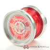
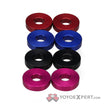
The yoyo itself looks interesting, but god that font is horrendous.
I suspect some of the ugly colorways may be the result of communication challenges between the manufacturer and anodizer. Often times what someone envisions a colorway should be is not translated well via an email order.
In the case of those C3 Astreas for example (which I agree are pretty ugly) they may have been described to the anodizer as ‘white speckle on red/blue base’. Unfortunately C3 had a laser engraving that really clashes with the speckle making it look overly messy and busy. In the case of the red, it also looks more orange to me as well. Not sure if commercial anodizers commonly do proofs before a run, but I suspect in some cases the answer is no. ![]()
If those Astraeas had a black engraving to match the black rims they would look great.
I agree the red hotdiggidy is not appealing at all. Although I’m not a huge fan of solid colors in general, especially red. Any washed out solid color I also stay away from, like moss green or sky blue. If I buy a solid I usually go for something vibrant like orange or azure blue.
On a side note, it’s a shame the splashes are so much more expensive on some yo-yos. I think a $5 upcharge is perfectly reasonable, but I see a $20 markup on all kinds of throws. I’ve got several yo-yos with boring solid colors like black or silver just because the cost of the splash models were too high.
The mustard tiger is what that colorway should be named
what about the “sewage splash”
Y’all being way too nice with the nicknames for this colorway ![]()
Anything with sewage colors almost never looks good tho. eg. this Fyfo
Just in general olive green isn’t exactly a pretty color either. Green is an easy color to get wrong imo. The same goes for yellows and oranges, and especially browns. Mixing them is dangerous and almost never yields a pleasant-looking colorway.
It’s Avocado, one of my favorite colors, hah. I actually like alot of these. The marbelish 7075 skyva looks good to me. The yellow drizzle monkeyfinger is horrible though. I know I’ve seen some bad ones but they’re not coming to me right now.
I have this exact yoyo in this colour. I love it.
Also that one long random drip looks like an accident!
I wish I would have found this thread sooner.
A year or so ago, just board looking through the store seeing only one type of color way left. Most them I was like “that is awful”
I’ll have to keep this thread in mind when I look through the store like walking through a museum.
We need a neon brown yoyo
Unless it’s just absolutely hideous I don’t really dislike many colors/colorways. Of course I have my favorites and preferences, but if I like the yoyo a lot in general and want it I’ll buy whatever color is left usually Idc. If I had to choose, I don’t really like those shiny gaudy gold colors, idk it just looks super niche. I like more yellow golds or “mango” so to speak like OD
Same here. I’ve had a couple of times where the only colorway left was actually the one ended up liking most (e.g. buying my M+ with only the green/gold available)
Green and gold is tight though in my opinion, I don’t have any green metal yo-yos I just realized, gotta change that
Just gotta share this Louis XIV lookin mowl yoyo.
https://www.instagram.com/p/CwAoHgYyPXh/
They’re calling it camo but yo this is
Hah ! I love it tho so sick to me
That is just so incredibly bougie-looking that I actually kinda like it lol, plus Mowl’s engravings are the best in the game in my humble opinion
