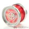
I plan on putting up a BST soon, and I wanna get a YYR with some of the money I get. Can anybody give me the lowdown on what the typefaces are like?
what’s a typeface?
I found that the Optima and Futura were the high-performance models out of the group, while the Helvetica and Gotham were your jack-of-all-trades type yoyos. The Comic Sans is a more casual throw and you probably won’t extract a ton of performance out of it compared to the others. The Impact is simply a novelty throw; like a heavy, squared-off ProYo.
I have the futura, Gotham, and helvetica. They’re all good. I agree with zslane. Get whichever profile looks most appealing, with their words in mind.
They are a line of monometals from YYR in the $60 range
Currently thinking I want the Helvetica the most, really like it. Just depends on how powerful it is
After a quick throw, it isn’t lacking in power at all, but it isn’t super powerful. It’s all around good, but not really exceptional at anything. It’s not at all a bad choice. I quite like mine.
I would agree with @AlvahD on that assessment. I think the Futura has a bit more power and stability than the Helvetica, but at the cost of a more severe shape (less comfortable in the hand).
Ah, maybe I won’t. Not really tryna get one of the sharper angled typefaces so ![]() how about the gotham?
how about the gotham?
I waffled a bit between the Optima and the Helvetica. I ended up going with the Helvetica, maybe embarrassingly, because I prefer the typeface. Also I liked the Comic Sans, but couldn’t stomach owning anything named after that typeface. Helvetica to me also made the most sense in black, but I wanted the green one, which I got. I’m happy with it, it’s my only YYR throw other than the Diffusion. It plays great, but at my skill level it doesn’t stand out vs some others like the MYY YO3 Hertz or the YYF Shutter or Uppercut. “Power” isn’t a term that comes to my mind much when I throw, but the few bi-metals I have seem to be most powerful (at least as far as I understand that term).
Yesterday I was considering selling my Gotham, so I threw it for a minute, and my exact thoughts were “damn this thing is actually good. I’m not gonna sell it.” The helvetica is just as good.
I have the comic sans and it plays very well . They aren’t fancy by any means but they definitely play above their price tag in my opinion .
