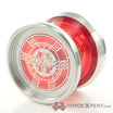
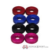
So I’m back with more ![]() this is my Duncan Metal Zero (I’m painting all my Duncans). Its the same concept as my other one but it just has more colors. CHECK IT!
this is my Duncan Metal Zero (I’m painting all my Duncans). Its the same concept as my other one but it just has more colors. CHECK IT!
Good? Not Good? what can I do to make it better?
I dig it, but next time, switch up the colors a bit. Your last one had a white background also, so this one doesn’t stand out as much as it should. But either way its still rad.
I agree with mike
ok ya i was thinking i should do a different base color but i just didnt haha next time for sure
If you are looking for ideas for a background paint…this stuff is always awesome to work with. http://www.amazon.com/Dupli-Color-Mirage-Paints-Gold-Magenta/dp/B0006L529M/ref=sr_1_2?ie=UTF8&qid=1324654060&sr=8-2
wooooo that stuff looks awesome
This is pretty sick
The concept works, but it seems you’re only hitting the outside of the yoyo. The inside portions are not adequately being touched.
Sometimes that looks good to people like me. It seems to break things up and make it not so busy when it’s very busy.
