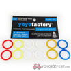
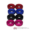
Vote above or comment below.
I’m going with the left I like how the center looks
I like the left, more even, and the black in the hub area too. ![]()
Left.
<insert some smart commentary referencing negative space>
Left. The colors are more evened out.
Right seems to have more color.
