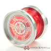
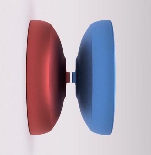
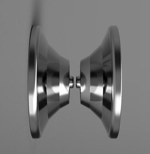
made a new throw today. 53x40. 4mm or 4.2mm gap i dont remember. 63-64ish grams. Inspired by old school yoyos, kinda like a mini organic genesis type vibe with it.
i want all your CAD files in my collection. ![]()
![]()
![]() thank you I appreciate that.
thank you I appreciate that.
I think the step off of the response is too close to a 100% flat angle here. The edge looks a bit sharp, too. The rest of the shape is looking pretty nice!
definitely see some genesis/severe step influence here! i like it haha. any story behind why these always come in red/blue halves? : )
Generally for fun ![]()
![]() sometimes its there so if I want to make changes or try a change I can see the differences between the halves more clearly and to tell which half is which when deciding if I like them or not.
sometimes its there so if I want to make changes or try a change I can see the differences between the halves more clearly and to tell which half is which when deciding if I like them or not.
For everybody that’s been asking for continuation of the Puffin saga.
Yes the Puffin line will continue under RVK.RT, over the years the Puffin series has become one of the things that people identify me the most with in the yoyoing community and Chris gave me the okay to continue with it under my own brand.
The Puffin2 is one of my all time favorite yoyos, the only problem with it is that it’s kinda hard to make a super stable and long spinning contest yoyo out of 6061 with the specs and shape the Puffin2 had, this is why I opted for a larger and wider variation for that extra kick for contests with the Puffin3.
However if you take a design like the Puffin2 and add SS rings on it you’ll easily make up for all that extra power needed. I decided to take it even further and upgrade the body material to 7068 and make it just a tiny bit bigger so it’ll sit comfortably between the the CLYW Puffin2 and Puffin3. This is literally an upgraded extreme turbo powered version of the Puffin2 and will be the the first installment of the new Puffin series under Rvk.RT. Please note that the design and artwork are not finalized and the prototypes are currently being shipped along with Freyja prototypes.
PuffinBI on the left compared to the Puffin2.
i made a yoyo tonight. This has to be the design im most excited about. I love it, but have absolutely no idea how it would play haha. 62mm diameter x 42mm width. 10mm axle, 4.4 gap, about 63 grams. Honestly in love with this one lol. Diameter is a hair smaller than the 420 but its a bunch smaller in width.
@Palli Puffin 2 was one of my favourite older CLYWs to throw – hearing it make a comeback as the Puffin Bi is absolutely crazy. I’m really pumped! : ) Any idea when it will be ready?
This one looks really cool spec-wise, though that ridge where it goes from the flat part to the steep profile looks like it could be a lot softer, for comfort.
Super digging it otherwise
when will Patrick get a signature? ![]()
![]()
The response bump or the the bump near the rim?
@PCaliyoyos you gotta ask neil that question hahaha
Near the rim. The response looks good to me.
Not, sure. This is the design for the first prototypes. Depends on how prototyping goes. They are on the way so I’ll let you know ;). The one on the left is Freyja proto2.
First crack at titanium today for fun. Titanium puff adder. 53x43mm 4.5 gap 64grams 8mm axle. did the best i could considering i didnt have the CAD for the original. There are some noticable differences in the rim and the fingerspin bowl but i think it came out pretty great with some unique twists on the original.
Another one. Stainless steel. 54x39mm, 4.35 gap, 12mm axle, somewhere between 63-64 grams. Could probably take some more off with a smaller axle but oh well. All the pieces fell into place with this design. Really like the cup too
designed this today. wantd to go for an organic W-ish shape but it didnt pan out and I just went for it and had fun with it lol. calling it the pattern because the cup, and because I wanted to include a lot of 5s in the design, hence, the pattern. 55diameter 45width 4.5 gap 10mm axle 64-65ish grams 15000ish moi
