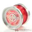
2 part question. First, which splash do you all think looks the best on these? The second question, if I bought a ditch today from yye, do they still come with the enamel pin? Thanks yall.
Horsehead looks killer in person, I have a Minitee in that finish. Hulk smash is cool, I mean they all are really lol. I think if it were me I’d go with that black and green swampy looking one because I have nothing like that in my collection.
I fear this falls under “personal preference“
Oh and yes, the pins are still a thing, and it will also include a random sticker and string
Yeah, I’m leaning toward the horse head nebula.although northern lights and hulk smash are making me pause ![]()
Decisions decisions….
Not a fan of well-defined streaks but they’re fine color combos. The Horsehead and Northern Lights look unique and nice. I went with Salmon Fade since it’s a classic CL colorway and didn’t have one yet, but it’ll be the only one. Solids are not the usual shades of colors and are easier to coordinate with outfits.
Pretty sure they make as many pins as yoyos in the run to be sold retail unless otherwise specified. One came with mine, along with a sticker and string.
Aside from aesthetic, what’s the difference between Ditch and Campfire? Specs look very similar, with the Ditch having a more organic profile. Campfire also seems to have a wider profile, but the weight of the two is exactly the same
As far as Ditch colors I like Northern Lights, Wolf Lake, and Light Blue
I don’t own a campfire so I can’t really make the comparison.
Allegedly a campfire is a lil Bonfire, which is a fantastic throw.
I would love to hear comparisons between the two as well
Campfire feels more solid/stable on the string while the Ditch is a bit zippier. They are both great pocket throws and I don’t think one it necessarily better than the other. Personally I like the lighter feeling of the ditch but that doesn’t mean the campfire is heavy, just feels heavier than the ditch.
Wait and hunt down 28stories. That beautiful bloody blue sky
Is there lore behind 28 Stories?
I have been meaning to make a thread about this. What’s up with 28s? I know it’s been around since at least first run peak, but what does the name mean? I NEED LORE
It was originally designed to mimic the cover of the book ‘28 stories of AIDS in Africa’. It was done by pioneer on the first run peak and bear vs man. At the time a percentage of the profits went to a charity that supported AIDS research (if I remember right). It’s been recreated since by gruntbull and whoever does their anodising now. No one has quite matched the original version, but certain runs look great, and it’s definitely a fan favorite.
Does someone have a pic of a gen 1 Peak in 28S? If what you say is true Ms. Kaede, then I wanna see it. Seeing the Leaf in 28S looked great, imo.
I love eye candy! ![]()
Is the top left a 28s Peak?! Holy taledo!
That one (top left) is specifically a second run 28s OG Peak. Since you requested some eye candy, here’s mine, gifted from Chris (founder of CLYW) to Ben (curator of the history of the Peak thread on YYN) as the prime example of a 28s Peak, and then owned by a couple more caretakers before making its way to me. By far the most valuable and beautiful yoyo in my collection. There hasn’t been a 28s to look like it since.
Well, I had a Mukbang for sale. Just swapped it for a ditch in Northern Lights. The pics look good anyhow. I was really just trying to find an alternate as I was gonna trade my silver one away.
Compared to the Ditch, the Campfire (2024) is slightly wider by just under 3mm, has a slightly beefier hub protrusion, so that center weight nullifies most of what the width brings. Back to back, differences are holistically a wash; they’re equally challenging and rewarding to me. Go with whatever looks better to/works for you. And/or has interesting lineage (respectively Gorge and Bonfire).
