New storefront design is here! love it so far and the new functionality is sweet but I have found a couple of tiny nitpicks:
on mobile the landing page is p busy and the slideshow controls + CTA button + hamburger menu + search box obscures the images (see below)
filtering by specs should be able to be done with a range instead of selecting each width individually
I miss seeing the number of units in stock for stuff, now it only seems to appear when the number is <10
Thanks so much for all the hard work you put into the site as well as all you do for the community @AndreBoulay; I know we’re all super grateful for everything you do!
I wish it felt less like a generic Shopify storefront.
About
Use this text area to tell your customers about your brand and vision. You can change it in the theme editor.
Everything is way too big. There’s so many rounded corners. None of this feels like it fits YYE’s branding. It looks like every other ‘modern’ website design from the last 5 years. It also has questionable accessibility, like the weird slideshow that has an arrow cursor if you hover over it.
Edit: also there’s a lot of text that now looks like this
I don’t need to be told that it’s a Breakaway twice. I don’t need to be told that it’s a yoyo trick twice. And I don’t need to be told I’m on the YoYoExpert website in the main part of the page.
Also all of the tutorials have moved but some of them don’t redirect to the new generic ‘page’ URL properly.
Hey Andre I recently made a list of brands that weren’t previously listed on the old side bar.
It’s probably not 100% comprehensive and I don’t know that all of them are still operational, but I could send you a DM with that if that would be helpful in any way.
The link in ‘Get a yo-yo’ takes you to the trick list, and the link in ‘print a trick list’ is just gone.
And all the images which were once on a white background now stick out like a sore thumb because they have opaque white backgrounds.
All of the tricks sections after Expert Part 2 are missing their white background.
Unlike every other part of the website, everything on this page has nice subtle rounded corners, or just sharp corners.
All of the images on this page are in the wrong place.
The shop button is also missing the quick navigation functionality, and because everything is so huge, navigating the site makes my hand hurt from scrolling so much.
One thing I struggle with is the search and tagging on the site is not great. Lots of times I’ll search for stuff by shape, size, other characteristics and it’s 50/50 I find what I’m looking for
Yeah - this was a soft launch and all of that was on the list to fix - but had to wait for the site to propogate - behind the scenes this was actually a very very large and intense data migration and there is a lot of cleaning up still but we had to get it in place and activate everything to do the final steps!
A lot of / most of what you mentioned is fixed and I appreciate all the quick feedback!
I actually still have a very much longer list of other things - haha. But it is my favorite kind of work.
I think you will find over time and near future a lot of tweaks will continue to be made as giving it that special YoYoExpert feel is exactly what I am about.
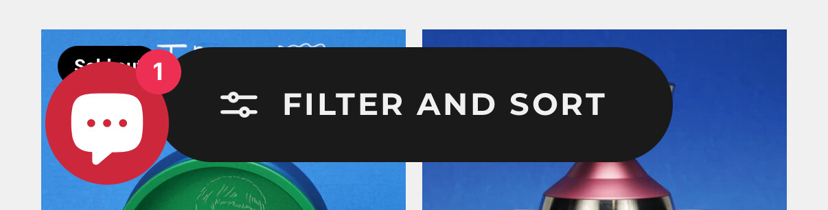
Also PLEASE get rid of this annoying chat bubble thing that permanently hogs part of the page. I’m so sick of these! They’re one of the worst things about ‘modern’ websites. Even the bureau of immigration has one (although it’s more unobtrusive & doesn’t appear on navigational pages). The (1) thing is just creepy and annoying. I just want to see what products you have, leave me alone stop telling me that the website is ‘messaging’ me—it’s not. I don’t go into a shop to be harassed by salesmen. It’s just one more thing that’ll either make me leave the store or if I persevere through the creepiness then I’ll end up blocking the element.
Live chat services would ideally live on the contact page. If I want to contact a person, that’s where I’ll go. In practice, I just don’t use live chat services unless they’re required for customer service (emails are SO much less stressful) and so I associate live chats with awful farmed-out customer service, and rigid automatic ‘chat bots’ that are just a glorified phone tree. Maybe a one-time popup explaining that you offer a live chat services would be helpful, but if that popup is controlled by cookies instead of session storage (why is this so common…) then it’ll just be another draining nag that I’ll have to close on every page I visit because I often have cookies disabled entirely.
It’s certainly improved. I’m glad some of my feedback has been incorporated. There’s still the annoying (1) version of the chat thing in the mobile layout, but Brands has been really cleaned up. It’s getting there.
I don’t love a persistent chat thing myself but I see it on other sites. It’s not a big deal but I’ll note unless Eric or Andre are manning chat 24/7 it’s very very unnecessary
I assume it populates a message to email for Eric or Andre to respond to or like zgrt if you send a message it goes to a text I’m assuming what’s app or something like that integrated and then Jorge legit will answer if he sees it which is mind blowing to me but I don’t think Andre has that kind of time to be checking messages like that