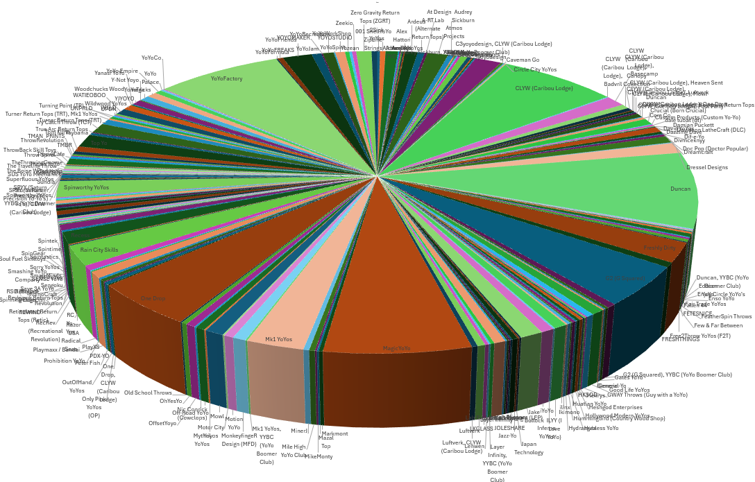
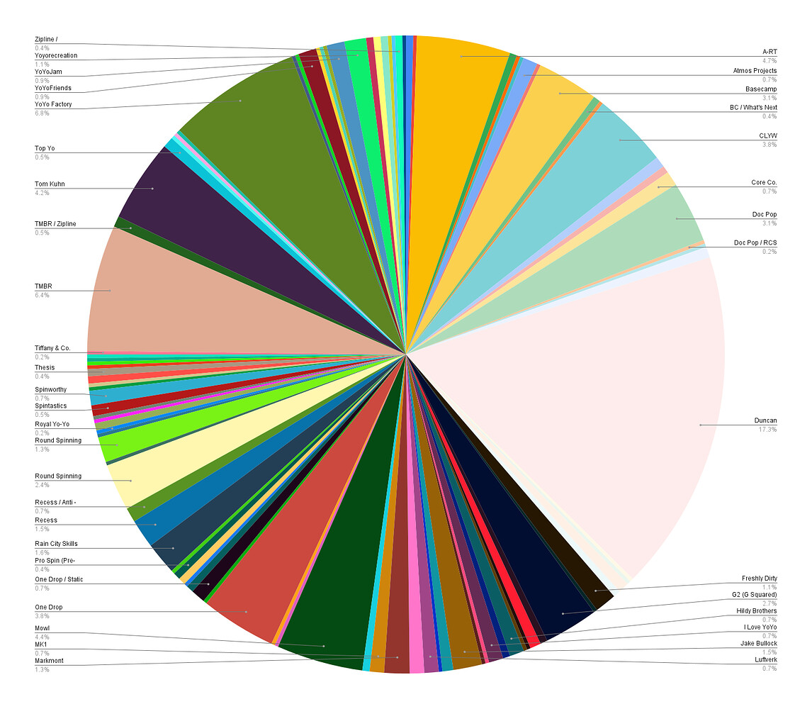
As I wait for my latest acquisition to arrive, I updated my yo-yo collection breakdown counting models by manufacturer. It doesn’t account for doubles (Duncan Gold Sparkle Imperial counted same as a Duncan Glow Imperial) but model design variations included (YYF Confusion different than YYF Hubstack Confusion).
What does your collection look like? Here is mine.
Brandon - I envisioned your collection being ever growing, represented something like this (boomer style). The Ghosts being life’s obstacles and Dots representing every Yo-Yo produced as you procure them all!
This seemed like fun until I was on my third builder, and it didn’t bother to label the last half. This was too much like work for a Sunday morning! I’ll take half credit.
Agreed, very cool idea. Only trouble is that I have 3 years of cataloging to do. I was super diligent in the beginning and then …. Well… haha… they were coming in too fast.
I’ll use this a the kick in the butt to get back on track. I’ve been wanting to do it anyway.
Tables are informative but not very fun. A word cloud weighted on percent of the collection for size and coloration based on sum could be fun and informative.
BI, is an oxymoron. I have extensive experience with data visualization starting with finance for companies like Swiss Bank as well as independent investment performance analysis and ending with the US intelligence community. Pie charts are useless when there are more than a few slices. Just trying to label these pie charts is making it impossible to read them. This is MUCH better represented by a simple table that lists the manufacturer and the total number owned. Making anything more complicated will just confuse.