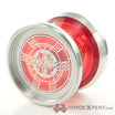
Which side should I display in my case, left or right? Vote in the poll above, or comment your vote.
https://farm6.staticflickr.com/5580/14302663857_dbdf53c228_c.jpg ShutterAnn by TotalArtist Yoyos , on Flickr
Shutter still available in the store here:
Built from the ground up, Shutter features an inner foil design to achieve a weight distribution that offers power, speed, and control! Gentry Stein Signature
Price: From $ 44.99 USD
Brand: YoYoFactory
1 Like
I like the splash on the left better but hate that you can barely make out the engravings in the middle.
Yuki
I agree. That is the one change I wish I could make on the left side.
Right you can see the shutter logo better.
Agreed.
I also like the splash better on that side though, but maybe I am just the odd one out on that.
The only thing that threw me off about the right side, was a splash of white at 12:00, 9:00 and 6:00, but not a blob at 3:00 to even it out more. Haha.
cr41g
August 11, 2014, 7:39pm
7
TotalArtist:
The only thing that threw me off about the right side, was a splash of white at 12:00, 9:00 and 6:00, but not a blob at 3:00 to even it out more. Haha.
Right as well.
As a clockface, I think it’s indicating 30 seconds past 9:00.
Zorro
September 23, 2014, 6:45pm
8
That is just amazing. :o :o :o
I voted right, because you can actually read the word SHUTTER!
