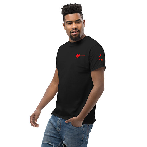
I feel like this is a very clean and nice look. I really like the red on black. I’m more partial to the larger logo on the sleeve but the scaled down one is also not bad.
I like the idea of a fundraiser shirt being more repressed more refined and less in your face with the logos. Muted colors and smaller logo.
However for a club shirt for meeting up or showing off the club at events in person (which I would love to see happen at some point like meeting at a big contest or something) I would rather a more bright vibrant coloring and larger club logo. Something that you can pick out in a crowd easily.
That’s my thoughts at least. Two different projects though and I assume Rob doesn’t mind us buying two shirts down the road lol
Black on grey ends up coming out weird, because the YYE border has to be a different color, and white pops too much.
As for the rest, I think maybe we do white on black, red on black, and grey on black, all with the smaller sleeve logo. I’ll still need a clean vector from YYE. The current logo I’m using won’t print clearly as it’s just a small PNG. There’s also no harm in offering the Lawnmower. If no one orders it, it’s not like it costs anything to have it up in the shop.
Let’s wait to hear back from other members before I go cleaning up the designs for sale. Though we do need some cutoff if we want to make these available in time to order Snapbacks with the proceeds.
Maybe we settle on 3-4 designs and set a cutoff for Friday the 10th that way we have our online meetup prior and can have the shirt as a topic in the meeting?
Seems there might be lawn mower interest. Small logo different color options seems a solid option
Is there still interest in the turtle mascot, hatchback logo, star field logo? Seems we have a handful of ideas and just need to set a date to solidify them.
This is my favorite iteration so far . ![]()
Yeah this is the only one I’d wear in normal life outside of a club meet or contest
Grey on black is Definitely my favorite too!
OK. Last image post (I swear!!!)
Here are the cleaned-up, print-ready mockups for our meeting next week.
We’ve got the “Club” shirt with white, red, and 70% grey logos and the “Lawnmower” shirt.
The Grey logo on Black shirt is ![]()
![]()
![]()
I really liked the bomb logo, if nothing comes of that I’d love to use it for something else even.
I would like to see a mock up of a Bomb logo also.
I 2nd Mr. Brandon’s Idea. Meeting on the 9th. Go Live on the 10th.
Still love this one the best. Maybe a simplified version of this on a shirt.
This would be great on the back of a T-shirt.
While I wholeheartedly Agree. I want to hold off on this design.
The reason Is if we use this design on The Workhorse. I would like to release the Shirt when the Yoyo comes out.
Unresponsive Yoyo Name Idea: The Flux Capacitor
I like that. Also thought The Flux for short which made me also think…The Flex ![]() to go along with The Workhorse
to go along with The Workhorse
Anti Yo nod: Fluchs Capacitor
Not sure if I can make the meeting this week. Thursday’s very busy right now. I will try hard to be attend.
I also have a “winter” indoor disc golf putting league on Thursdays which I historically have had a very strong showing. I haven’t been there yet this year due to a busy Thursday schedule. I have cashed every time that I have ever played over the years. I don’t attend often, but with the short attention span of the youth and for any new players, I need to re-establish “the fear” for this year.
OK time for the punch line.
I vote to name the unresponsive yo-yo “The Participation Trophy” despite the fact I have never received one. If you loose you don’t get ice cream!
