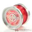
My YYE edition code 2.
Hmmm…I had to think on this one. I went left, because it seems more balanced. I also like the black on either side of that half.
Right. I think the black splotches look weird on the left
Left. Cool splash while still having everything nice and readable.
Left ![]()
I like right for some reason.
Left, I like the more expansive red.
