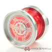
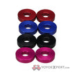
Which side of my YoyoExpert Edition Code 2 looks better? Vote left or right in the poll, or comment your vote.
https://farm4.staticflickr.com/3832/13859463263_3a91f0cc9a_z.jpg Code2 YYE by TotalArtist Yoyos , on Flickr
Code 2 still available in the store here:
We design and build the world's finest yo-yos in our workshop in Eugene, Oregon, USA.That's right. In a world full of outsourcing, we are 100% committed our maker roots. It is no doubt the more challenging way to go and for sure a path less traveled....
Right. I like the extra silver.
Both halves would look soooooo much better in my collection!!
Mofoya
April 28, 2014, 12:03am
4
I had go with left… the colors are distributed more evenly and you can read the engraving much better. It’s cool that the one drop logo has a good background color on both sides!
Left - the text is still nice and readable while still having interesting splashes.
Logi
May 14, 2014, 9:43pm
6
Left, nice clean looking logo.
