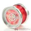
https://farm8.staticflickr.com/7569/15464023897_ff9928139e_o.pngBenchmark V - YYE Edition by PZorro14, on Flickr
my old benchmark v finally made it to you
![]() Yeah, and it’s awesome.
Yeah, and it’s awesome.
Something I like especially about this one. ![]() Left for me, more red and pops more. But, the darkness of the right is intriguing…just not enough for me.
Left for me, more red and pops more. But, the darkness of the right is intriguing…just not enough for me.
Right. I like the contrast between the black and silver.
I like that side best too for the same reason.
