A lovely, creative freestyle from @Jckpth at UYYC not too long ago.

Using a new monometal prototype.
A lovely, creative freestyle from @Jckpth at UYYC not too long ago.
Using a new monometal prototype.

Frekin incredible performance!
Profile pic?
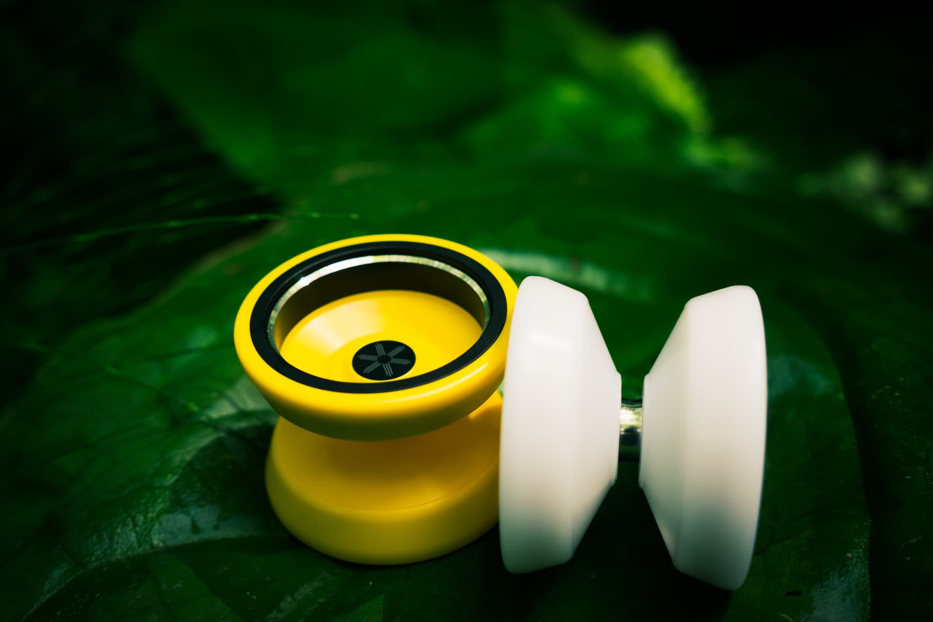
Such a good yoyo! A great sig for a great person.
tricky trick w/ asterisk ![]()
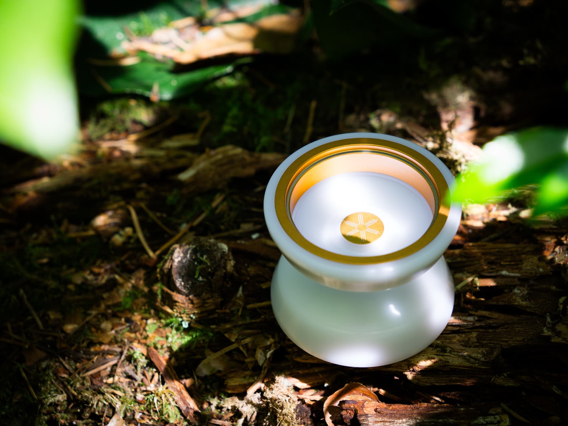
Blush is AMAZING looking
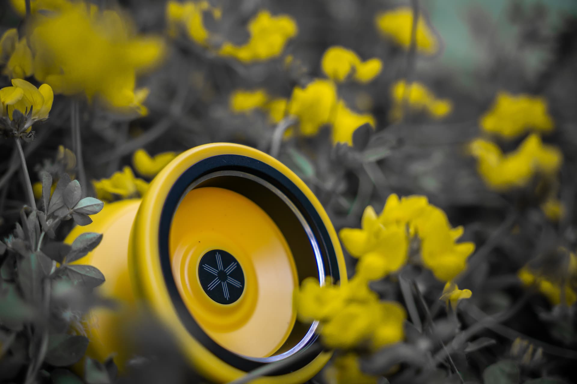
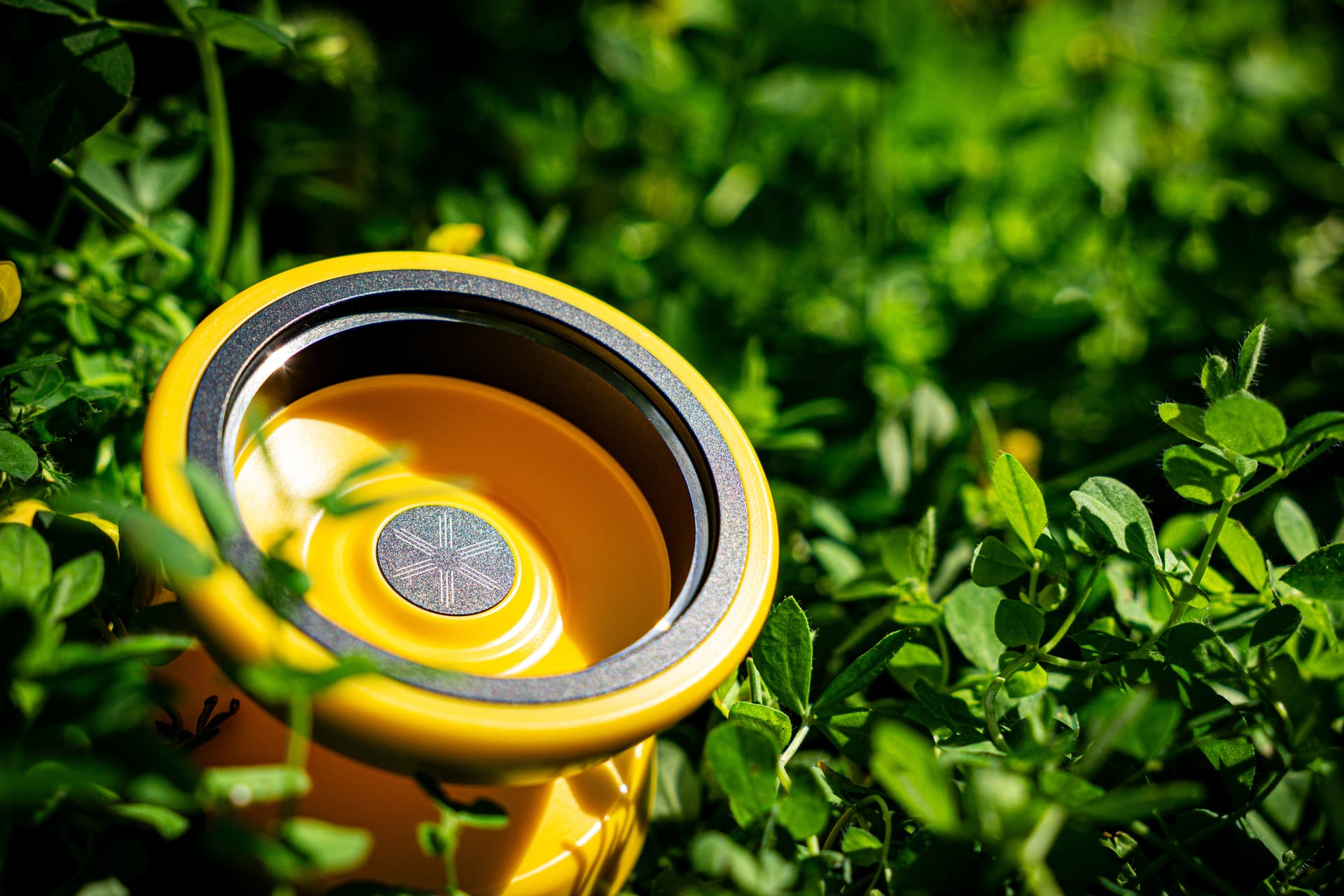
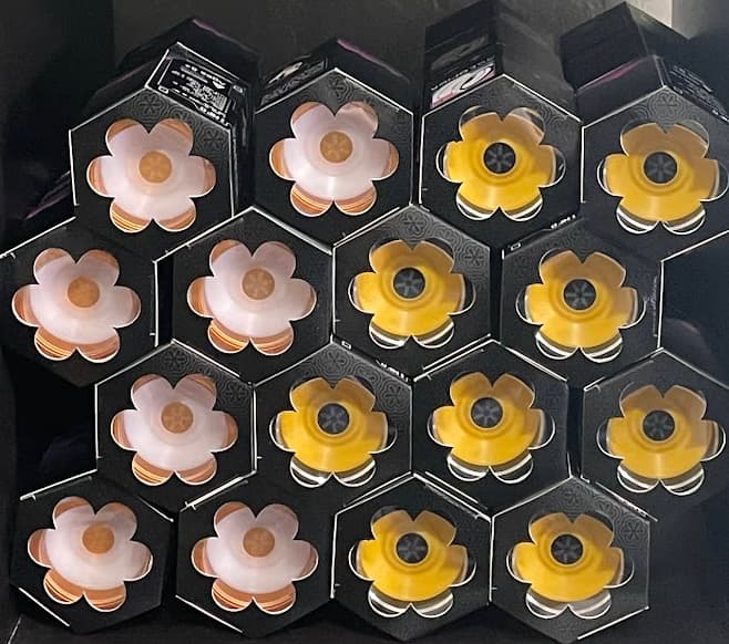
Digging the looks of the Asterisk! Kind of giving off Rally vibes to me. I dig!
tysm to everyone who got an asterisk. it means the world to me that so many people like it.
Heres a celebratory trick.
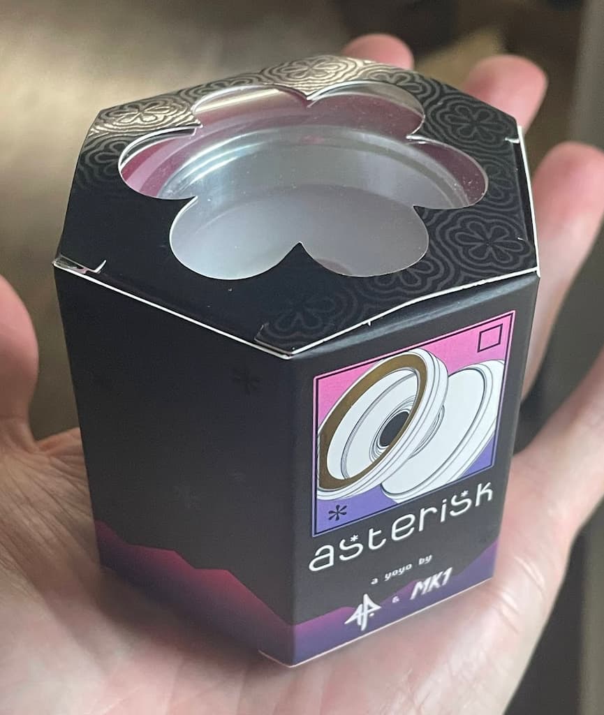
I hope you all enjoyed the yoyo I mean packaging for the Asterisk. If you have one, you’ve seen the packaging already. If not, you’ll see photos at the end of the post, but I want to take you through the journey. The yoyo was ready for production in mid 2024 and this was a project that I had time to spend, so we got to work.
Some words from @EOS44 will be in quote boxes.
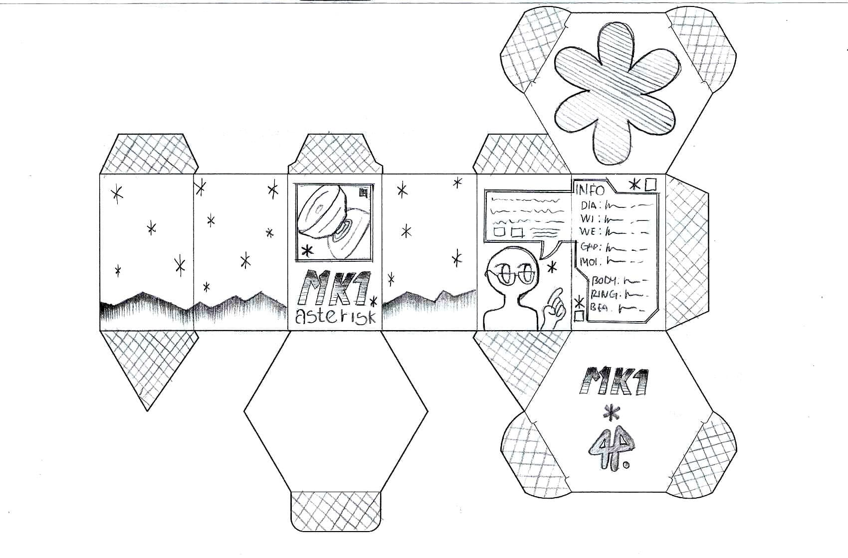
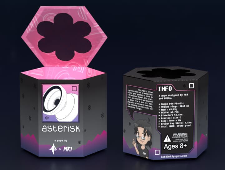
The existing mk1 hex box template is great because it already fuels a lot of artistic ideas via its shape and proportions. I knew from the start I wanted to use it and just make a unique graphic version of it. I printed a couple hex box templates on a letter page and started sketching.
I had the desire initially to make some sort of manga page inspired box, but after sitting down and actually looking at what the box template is, I quickly changed that decision. I kept the existing theme and just proposed some in-theme changes: a different color palette and gradients, asterisks for stars, and a new face for the box, with a square illustration that resembles perspective diagrams for a product design blueprint. The only idea I kept from my initial desire of making a manga page was a little character that has a bubble speech, which turned out perfect for the specs and description for the yoyo. I sketched on paper and did a small digital illustration for the character, which was eventually named “Helpful Nerd”.
I also sketched and drew a special font for the asterisk box. Once the overall vibe of the box was this defined, I just tried to sketch a font that stayed in line with the overall existing design of the box. Drawing lettering is difficult!.
The package die lines themselves were based on the standard Mk1 yoyos hexagon box, but with a different lid cutout shape. Since no-one can stop me, we put a uv-spot layer (the asterisks, word/art box outlines, and lid) and hot foil treatment (the aluminum sections of the yoyo on the front). You can see the uv spot layer much easier in person - look especially for the lid, which has an undulating pattern of ripples around a set of asterisks. It’s fun to touch.
The packaging supplier helpfully fixed an error on the die lines:
The flaps on the top have a “bite” out of them so they don’t block the cutout window when the carton is closed.
Thanks for the behind-the-scenes info, never realized how much work is involved with packaging… truly a labor of love! Thanks for your hard work!
This thing is outrageous, it spins forever. I’m over here like I ran out of tricks I know but it’s still spinning. ![]()
very interesting read.
I loved the box and thought it was unique upon first glance. So many details upon further look. Thanks for the fun box opening experience!
The yoyo itself is a DREAM. Anybody on the fence should def grab one!
So darn good!
@MarkD when is the large monometal from nats going to release?
Man yall who got yo see all the cool throws at nats that haven’t been posted about yet are lucky
The round grey one? Working on art/packaging/etc - might make it this year, might not.