Knotcreators Official Thread! (Introducing: S2 - Our Master Thesis of design)

Hey yall!

I realize I never made a post here and decided I should to let yall know what we’ve been doing!

Knotcreators is a colab effort between Myself (Josh Yee, 2017 US National 5A champion, 2018 BAC and California State 5A champion), and my fiancee Mei (Design wizard of AutoCAD and Solar design). We started our brand as a fun side project when we realized that the dream yoyo I had as a vision in my head had nothing quite like it on the market.

Our first yoyo was a tiny run that was the dream of mine for years that we called the Shibari, It was an undersized yoyo that had a design heavily influenced by some of the earlier Japan produced metal yoyos around 2011.

From our first success, we decided to push our experience into the realm of Bi-metals, and we produced a Bi-Metal yoyo for Mei that was everything she wanted in a yoyo. We also introduced our artist friend Folfelit to create our logo for the yoyo, and she is the one who continues to do all of our artwork designs today.

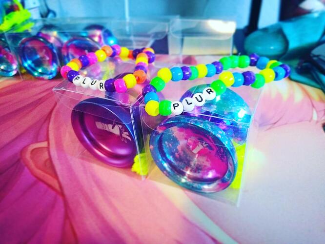
With the idea of following a theme for each yoyo we create, we decided to create a yoyo that was a tribute to the Rave community, that is a scene that Mei and I are heavily involved in. Thus, the PLUR was born!


We strived to create a yoyo that was inspired by rave, with the heavy hitting feels of EDM, the bold and bright colors inspired by LED lights, and the smooth feel of getting lost in the sounds of trance.

We took the PLUR through a few design iterations and fine tuned some issues we came across until we had a final design that we truly knew was what we wanted. Its been about a year since the first proto was made, and we think this is for good reason!

PLUR stands for Peace Love Unity and Respect, which have been the foundations of the rave scene since the start. As long time ravers ourselves, we wanted to represent these things in the yoyo world as well as we believe sharing this concept and keeping it as a moral for ourselves creates a positive and supportive world all around us.

66 grams
55mm diameter
46mm width
Centertrack bearing

More photos and info can be found on our instagram at https://www.instagram.com/knotcreators/

thanks for letting us share the love!
21 Likes

@HaruRay where can i buy???

4 Likes

this thread is awesome!

3 Likes

New video featuring the SENPAI by our own team member Googahgee!

8 Likes


Senpai

Diameter: 59.5mm
Width: 44.2
Weight: 69 grams (nice)

The Senpai demands attention with it’s heavier weight and feel, and a contest orientated oversized body means that it has absurd amounts of power behind it to really push your trick creation.

Will it notice you?

Colors, art, more info coming soon!

5 Likes

I remember you Sir, you entered my worlds longest sleeper contest we had at the park in San Francisco. That was the day I got my first bolt cause Doc was there with his doctors bag. Man good times I tell ya!!

8 Likes

Colorways for the Senpai announced!

01: “Hatsune”


02: “002”

03: “rem/ram”

04: “NekoNyan”

10 Likes

man those colors are dope!
(I know the whole anime and hentai scene is all about senpais- but senpais are the worst. F&@! senpais for real)

The Senpai is a yoyo that commands to be “noticed” with it’s larger diameter and heftier weight.

The design of this yoyo pushes the limit for a greater weight without feeling bulky to ensure more power with a throw, thus greater stability, balance, and spin force. A smooth blasted finish tops it off for a nice feel during grinds, and the flat inner ring allows “talon” grinds to be done with ease.

Featuring custom artwork of our original character “Harumi” by Folfelit!

Specs:

Material: WIA (Waifu Infused Aluminum)
Diameter: 59.5mm
Width: 44.2
Weight: 69 grams (Nice)
8 Likes


Proud to present our newest yoyo that is a collaboration between KnotCreators and OP Yoyos!
We proudly bring you, the Typo! Signature yoyo of Abby Brodsky!

Here are Abby’s own words about the creation of this yoyo:
“Hi Y’all Abby here! As some may or may not know, I have a bit of a reputation for typos, whether that’s in discords, or group chats ,they follow me, and now I am presenting my sig, the Typo to commemorate all the spectacular typos!

The Typo has been a long time coming, this yoyo has been in the works for the past 2 years, it’s been quite a pandemic project so to say. It all started with my longtime friend Jordan messaging me one day being “Abby! Let’s Make your sig like I promised I would do on Smashing!” and I said, “hell yeah let’s do it!”, And then we did it! As the years progressed some things changed like joining Knot Creators! The one condition I had on joining the team was that I could make my sig with KC and Josh said, “hell yeah let’s make it!”, and then we made it! And now it’s a KC X OP collab sig! (How cool is that and how often does that happen???) I now have a sig with some of my best friends in yoyo which I love and, I’m so happy celebrate this release with friends! This sig is everything I like in a yoyo, fast playing when you want it, stable, and long spinning for my tech tricks, worthy of competition (when I feel like it) and comfy to hold! And y’all wanna know the best part??? All the sig colors are named after minerals!!! It’s perfect for my geology brain! Anywho I think you all will love the typo as much as I do it’s a fantastic playing yoyo and I’m so psyched to share it with you all!

Specs:
Weight: 66 Grams
Diameter: 54mm
Width: 42mm
Material: 7068 Alu with SS Inner ring

Super excited for players to try this out!

8 Likes

I am a geologist and I love that.

If that really nice green colorway is named olivine then I will be too excited. Olivine is my fav mineral.

EDIT: ok so the green isn’t named olivine but it’s still tight. It’s vesuvianite.

2 Likes


As a company, we have always liked the idea of not necessarily sticking to one design model. Where many companies stick to a certain attribute that makes their yoyo’s very identifiable as “theirs”, we always liked the idea of having a vast array of yoyo experiences under the name of our brand, so that with every product we make comes a very different feeling and experience.

We had gone through different shapes, sizes, weights, and materials, but there was one thing that we hadn’t touched yet, and that was outer-rim bi-metal yoyo design. This proved to be an interesting challenge for us, as we had never experimented with this kind of design before, and we were essentially approaching it blindly. Thanks to some insight from some very skilled and prominent yoyo designers (Thank you Mark from MK1 yoyos and Patrick from Dressel!) we were able to bring our idea into a reality and achieve the design we wanted!

“Zaphkiel” was born from the idea of creating a competition styled bi-metal that takes organic inspired form for comfort and aesthetic, but shapes it into something that will maintain power and speed throughout movements. A size that falls into a larger diameter and width makes this yoyo easy to control and catch, with a weight distribution that gives a powerful feeling, but without a clunky feeling.

The graphics on the Zaphkiel are also a special and notable feature as it was designed and drawn by Mei! Taking inspiration from “Kurumi’s” (Date A Live) angel power of controlling time (Also where the name Zaphkiel comes from) Mei created the graphics for this yoyo with intricate details that you have to see up close to appreciate all the little details. We expect this won’t be the first time you see Mei’s design skills on our yoyo art besides the yoyo designs themselves!

  • Diameter: 54.8mm
  • Width: 45mm
  • Weight: 65.5 grams
  • Material: Alu with SS rim
  • Bearing: Size C step cut

Coming 2023
We think you all will love it!

J

14 Likes

That color is beyond good :heart_eyes_cat:

1 Like

Yes! This color is prototype only, but the colors we have for the final run are going to be incredible so definitely look out for those soon!

2 Likes

Man… what a beauty! I don’t have anything remotely like this or any of your throws for that matter. Will be keeping me eyeballs peeled for the drop.

1 Like

Video!

4 Likes

This yoyo look sick, I did not know your brand, I just put couple of likes on your post, great looking products!

1 Like

Loving the look of your new throw! Looks steampunk to me.


Two colorways!
“Blood Moon Eclipse” which is our red to black, and our premium colorway “nightmare” which is a fire inspired acid wash (and much inspired by Kurumi of course)

9 Likes


Proud to present to you all the yoyo that we are considering our “master thesis” as it is a testament to all we have learned and experienced through our years as a company!
We went back to our roots and developed a new and improved version of the yoyo rhat started it all for us.

Read our blog post for our design approach and more info!

https://knotcreators.com/2024/03/25/s2-dream-concept-reality/

15 Likes