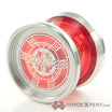
In the pictures on this very site, of the recent restock of the CLYW Arctic Circle 2 I noticed that the Confetti colorway looked a bit different from other CLYW throws in Confetti. The yellow on the AC2 looked a bit more like orange. My question is, is that how it actually looks in person or is it just simply the lighting in the picture? I’m thinking of getting one from a different site but would like to know if it is going to match all my other Confetti colored throws or not. Feedback would be greatly appreciated. Thanks for reading.
Clyw will often change their colourways over time. Look at ashberry, 28stories, northern lights, red and clear as examples. So I don’t doubt that it would be changed. Also confetti looks like wonderbread logo
It definitely does resemble wonder bread. I always thought Jawbreaker would be a good name for it also.
Nailed it.
We try to keep our pictures as close to the actual color as possible so what you see is what you get.
