So I made this in illustrator today,
This type of BST or the Normal kind?
I want that Six…
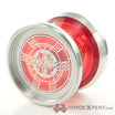
That Six is clear ano’d, not raw. Nice design though.
oh… derp
Fixed
Dat advertising your BST on the general forums though. Dat sneaky advertising…
Wants, Bonfire, has Bonfire…
lol trust me I don’t mean too ![]()
Biggest problem I see with making a BST an image is it’s not searchable.
Good point, I will add keywords
I see nothing here layout-wise that can’t be achieved through text formatting.
Yes, that and the fact that if you want to edit it you have to redo the image every time something changes.
To be honest, it doesn’t work for me.
Well, if its a standard image with just a black background or something, you could just take it up in photoshop/paint/any other image editing program and just black out whatever you want to change and fix it.
yea its super easy to change it I mean I changed the six from raw to clear anodized, and replaced the F(x) picture for the bonfire one and changed the words in like a minute and and half ![]()
also do you guys recommend different colors? or do you like it the way it is?
To be perfectly honest, I don’t like red text in general, especially not on that dark of a background. It’s harsh on the eyes. The bright blue also seems to clash and make it difficult to read/look at. I’d try to find some colors that aren’t so contrasting, more complimentary, just so it’s easier to look at, but different enough that the important parts still stand out.
Other than that, I do like the idea. It’s clean and well organized, the same which can’t be said for many text only BSTs. The only potential issue I could see with the format, is that it doesn’t lend itself to multiple pictures of any yoyo. That’s not a problem if your throws are in fact mint, because one picture would suffice. But if you have multiple dings and scratches on something, having a picture of all defects could be challenging with this format. As a buyer, I’d want to see every damaged part in a picture, but I guess that can also be solved by sending more pictures if the buyer has interest.
Regardless, neat idea.
I agree with the color ideas.
I also don’t think the dark grey/black around the pictures of the rock/yoyo doesn’t look too good. Maybe its just me, I’m kinda funky when it comes to colors.
