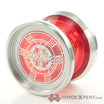
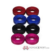
Noma is just one of those throws where one is not enough hahahah
The colors look so much better in person. The color gamut on screens can’t reproduce many colors the human eye sees. And produces some the human eye can’t differentiate, which explains why some monitors have more colors than the human eye is said to be able to see. Colors have a continuous change so it’s hard to make a comparison by numbers.
My Butterball in Himalayan Rocksalt is more vibrant and indeterminate than in photos. It’s between peach and pink and neither of them.
Noma in Taro is restrained. It’s not ube after all. Prime example of how tasteful these are.
Got a Cephas ES in Honey and it’s slightly golden brass without being gaudy. It looks great next to the Noma.
Waiting for a pre-order in Oatmilk. That color called out to me when I saw it on previous releases. Incredibly refined.
Getting a different colorway each time. They’re all great.
And the yoyos play fantastic.
This topic was automatically closed 30 days after the last reply. New replies are no longer allowed.
