


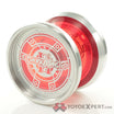












Please let us know how the Kyoto is when you receive it and have a chance to play with it. It’s such a stunning piece.
2 Likes
FWIW, I have a Kyoto and love it.
4 Likes
Thank you so much, appreciate that. That’s good to know. For now I have a Shido and Smol. Love them both (even though I’m more of a beginner).
3 Likes
Same here! It was my first titanium throw, and it’s sweet!
3 Likes

Sometime last year, Vladimir was telling me about designs and players around the industry that had caught his eye, and that he found inspiring. He was most effervescent about a yoyo called the Naan, and the people behind the design. At the time, I hadn’t heard too much about Champire, but quickly got up to date on who they were, and why the Naan was significant.
I got my hands on one, and it was one of the most refreshing designs I had played with in a long, long time. The incredible sensitivity to feel and attention to detail was so obvious in the way the Naan felt in hand and in play.
When the opportunity arose for us to work on something together, we were so excited to see what could come of it.
The rest of these Design Notes are excerpts of the entire journey, written by Vladimir Glazkov, as well as Champire’s team designer.
Enjoy.

Specifications
Diameter 49.5mm
Width 45.6mm
Weight 61.8g
Material 6061 AL
—
By Vladimir Glazkov,
“The first time I saw Naan was at the end of 2024 — it must have been on Katayama’s social media. Then, sometime in 2025, I found out it was released under the CHAMPIRE brand.
CHAMPIRE caught my attention right away. There was something special about them. They’re an indie brand — small, alive, and really interesting. You can tell they were inspired by A-RT, but in my opinion that only worked in their favor. CHAMPIRE started developing their own recognizable style pretty quickly.
When I went to Japan for the first time in 2025, there was only one thing I definitely wanted to buy there — Naan. In the end, Ryosuke Kawamura helped me get my hands on one.
What I immediately liked was how effortless Naan felt. It doesn’t feel like the yo-yo is trying to prove anything. It just feels really nice to play. In the end, Naan became one of the most interesting yo-yos of 2025 for me.
Later, the idea came up for Atmos Projects to make something together with CHAMPIRE. I didn’t want to just put two logos on one model — I wanted to actually mix our ideas, concepts, and approaches.
That’s how HAAM came to be.”

“The concept itself was pretty simple:
Diameter — Naan.
Width — Hamr.
Weight — Naan.
Profile — Hamr.
Rims — Naan.
Center area — a mix of Hamr and Naan, including the tiny spike haha.
I really wanted to keep that same softness and lightness of Naan, while adding the width and character of Hamr.
In the end, HAAM turned out exactly how I imagined it.
Thanks to the whole team. We did it.”

From Champire’s designer,
“When I heard about the collaboration between Champire and Atmos, it was unexpected. At the same time, knowing that Vladimir and the other members liked Champire yoyos, and that Alan Tokushima was a huge fan of Atmos and Vladimir, I felt the collaboration was bound to happen at some point.
A group chat was immediately created for Champire, Atmos, and myself, and Vladimir sent me a rough idea of what he wanted, along with a reference image of the Hamr and its drawings. It was very precise and easy to grasp the image, so the basic shape was quickly determined.
Next, as a designer, I considered the specifications. Hamr has a strong feel from the characteristic H-shape. Naan has a solid feel, but its shape and size balance prevents a fully smooth feeling.”

“After comparing the two yoyos and considering their respective strengths, I interpreted them as creating a fun yoyo that could be enjoyed easily. My approach was to apply the width of the Hamr to the diameter of the Naan, borrowing the thickness and radius from each model. The weight remains the same as the Naan, but the H-shape increases the power, so I kept it that way. Finally, I incorporated some of Alan’s (another of our designs) features into the Haam.
The shape of the hub on the side face was Vladimir’s suggestion; he wanted it to combine the features of both yo-yos while resembling a sunflower seed (hamster food). I adopted it immediately.
Once the prototype was complete and I played with it, it completely met my expectations.”

“It felt like the Naan’s buttery smoothness combined with the Hamr’s power, resulting in a yoyo that leveraged the advantages of both.
The design isn’t biased towards either brand; I think we’ve managed to incorporate both styles, creating a simple yet eye-catching design with subtle touches that keep things interesting.
Please enjoy Haam!”

Box art, illustrated by hand by Kouki Katayama.

They’ll be available in six colorways — Upper Brown, Oatmilk, Mame, Orenji, Tanso, and Raw.
//
Thank you for reading our Design Notes on the Haam! We’d love to hear what you think.
12 Likes
Awesome collab!
1 Like
Thank you! It was such a joy and honour to work with Kouki-san and the rest of the Champire team!
2 Likes
Ohhhh yeaaa
1 Like
Just when I think I’ve ordered everything I need from Atmos! Still have two on the way!
Unbelievably stoked for this!
That box art is too good!